Java Library Integration
ImportantThis document is ONLY for the customers using the new console. For the older version, refer to the documentation here.
Since we are gradually migrating all our customers toward our new upgraded console, we would slowly deprecate the older version.
Unbxd Search JS Library helps you build awesome search experiences with Unbxd Search powering the search results page. With a few simple configurations, you can quickly get up and running with our default template to experience the Unbxd Search functionalities.
NoteThe current version is v2.0.0.
Quick Integration with Unbxd Template
There are two ways in which you can quickly get up and running with our default template to try out our JS Library functionalities:
If you have a console account already, follow the steps below:
- Go to the console dashboard & click the Website Preview button.
- Then click the Download UI Kit button to download the Unbxd Default template package for your catalog.
- Unzip the package & open the index.html file in your browser to view the search results landing page for your catalog with the Unbxd default template.
OR
- Download the Unbxd Search Library default template package from here .
- Unzip the package & open the index.html file inside the folder.
- Update the global variables UNBXD_SITE_KEY and UNBXD_API_KEY in the
<head>section<script>tag of the index.html file with your Site key & API keys.
window.UNBXD_SITE_KEY=  < your site key >//yoursitekey
window.UNBXD_API_KEY= < your API key>//yourapikey
Update the global variable “UNBXD_MAPPED_FIELDS” with the field mapping of your catalog fields.
 window.UNBXD_MAPPED_FIELDS = {
   "unxTitle": "title",
  "unxImageUrl": "Image_Link",
   "unxPrice": "Price",
   "unxDescription":" productDescription"
};
Finally, open index.html in your browser to view the search results landing page for your catalog with the Unbxd default template.
Quick Integration to Your Site
To integrate the JS Library into your site, follow the following steps:
Include the JS Library. This can be done in two ways:
- Adding it as a URL to your HTML file. First, add the following CSS file into the “ section of your HTML page to get the Unbxd default theme styles.
<link rel="stylesheet" href="https://libraries.unbxdapi.com/search-sdk/v2.0.0/vanillaSearch.min.css" /> Then add the following script file for the library at the end of the body section.
<script type="text/javascript" src="https://libraries.unbxdapi.com/search-sdk/v2.0.0/vanillaSearch.min.js">This will set the “UnbxdSearch” constructor on the window object.
- Install it via npm using the following command
npm i @unbxd-ui/vanilla-search-libraryand import the UnbxdSearch class like below:
import UnbxdSearch from "@unbxd-ui/vanilla-search-library";Note: To include default CSS, use the following command
import "@unbxd-ui/vanilla-search-library/public/dist/css/vanillaSearch.css";Or if you are using SCSS, include the below file
import "@unbxd-ui/vanilla-search-library/styles/index.scss";Create a search object using UnbxdSearch(class/constructor) with the relevant configs.
window.unbxdSearch = new UnbxdSearch({
 siteKey: "demo-unbxd700181503576558",
 apiKey: "fb853e3332f2645fac9d71dc63e09ec1",
 products:{
    productType:"SEARCH",
    productAttributes: [
            "title",
            "uniqueId",
            "price",
            "sku",
            "imageUrl",
            "displayPrice",
            "salePrice",
            "sortPrice"
      ]
 }
});
A full configuration will look like:
window.unbxdSearch = new UnbxdSearch({
 siteKey: "demo-german-unbxd809051586180937",
 apiKey: "16e3cf8d510c50106d64f1ebb919b34e",
 searchBoxEl: document.getElementById("unbxdInput"),
 searchButtonEl: document.getElementById("searchBtn"),
 products:{
   el:document.getElementById("searchResultsWrapper"),
   attributesMap: {
      "unxTitle": "title",
      "unxImageUrl": "imageUrl"
      "unxPrice": "displaySalePrice"
   },
   productAttributes: [
      "title",
      "imageUrl",
      "price"
   ]
 },
 spellCheck: {
   enabled: true,
   el: document.getElementById("didYouMeanWrapper")
 },
 noResults: {
     el: document.getElementById("noResultWrapper")
 },
 facet: {
   facetsEl: document.getElementById("facetsWrapper"),
   selectedFacetsEl: document.getElementById("selectedFacetWrapper"),
   applyMultipleFilters:false,
   defaultOpen:"FIRST",
   isCollapsible: true,
   isSearchable: true
 },
 pagination: {
   type: "FIXED_PAGINATION",
   el:document.querySelector("#clickScrollContainer"),
   onPaginate:function(data) {
   }
 },
 breadcrumb: {
   el: document.getElementById("breadcrumpContainer")
 },
 pagesize: {
   el: document.getElementById("changeNoOfProducts")
 },
 sort: {
   el: document.getElementById("sortWrapper"),
   options: [
     {
       value: "sortPrice desc",
       text: "Price High to Low"
     },
     {
       value: "sortPrice asc",
       text: " Price Low to High"
     }
   ]
 },
 loader :{
     el:document.getElementById("loaderEl")
 },
 productView:{
   el: document.getElementById("productViewTypeContainer"),
   defaultViewType: "GRID"
 },
 banner: {
   el: document.getElementById("bannerContainer"),
   count: 1
 }
});
You can also modify the configs anytime using the “updateConfig” method on the returned object. “updateConfig” accepts a new config object as an argument that will merge with the existing config object.
const  unbxdSearch = new UnbxdSearch({
 siteKey: "demo-unbxd700181503576558",
 apiKey: "fb853e3332f2645fac9d71dc63e09ec1",
 products:{
    productType:"SEARCH"
 }
});
unbxdSearch.updateConfig({
 products:{
    productType:"CATEGORY"
 }
});
Refer to the “List of Available Configurations” section below for a full list of all available configs.
Nomenclature
You will see the following terms:
- el – The term el refers to a DOM element. So the rendered component will be rendered inside this DOM element.
Ex: document.getElementById(“searchResultsWrapper”). - template – templates are functions where you can return the HTML string that needs to be rendered. This provides you with the power of the entire JavaScript to build your desired HTML string
All the class names generated by the library will have the prefix “UNX-“. So you can use it to customize styles.
Detailed integration guide
The final integrated result that we aim at with this quickstart can be seen at this codesandbox.
Let us walk through the important configs that need to be passed along with their values for powering the search results page.
Authentication
Once installed, you need to authenticate the Unbxd library using your Unbxd account keys (also known as Authentication Keys).
Whenever a customer signs up with Unbxd, they are issued one or more site keys and API keys depending on their use case. Some common scenarios:
For a customer with one website and two environments (production and staging), two site keys (one for each environment) and one API key are issued. For a customer with more than one website (multi-website vendor), the site key would be issued for every website + environment combination. So there would be an “n” number (equal to the number of websites) of API keys generated.
For multiple site keys, check if you have:
- more than one environment
- more than one website
- different product set for staging and live
- wish to track search performance and clicks separately for every microsite.
To get your Site Key and API Key in the console, please refer to the steps mentioned in the Configure Site section.
Pass the Site Key and API Key from the console in the “siteKey” and “APIKey” configs.
siteKey
| Property | Data Type | Required | Default | Description |
|---|---|---|---|---|
| siteKey | string | true | NA | Site key assigned by Unbxd (the unique identifier for each customer/site) |
API Key
| Property | Data Type | Required | Default | Description |
|---|---|---|---|---|
| siteKey | string | true | NA | Site key assigned by Unbxd (the unique identifier for each customer/site) |
At the end of this step, you should have the Site Key & API Key which can be passed into the “siteKey” & “APIKey” configs as shown below:
const  unbxdSearch =new UnbxdSearch({
 siteKey:"",
 apiKey:""
});
Types of Pages to Render
Unbxd has two product offerings:
- SEARCH: Powers search results pages
- BROWSE or CATEGORY: Powers category listing pages
Pass a config parameter called “productType” to indicate whether you want to render the search results page (productType= “SEARCH”) or the category listing page (productType= “CATEGORY”)
const  unbxdSearch = new UnbxdSearch({
 siteKey:"your site key",
 apiKey:"your API key",
products:{
    productType:"CATEGORY" //SEARCH , CATEGORY or BROWSE
}
});| Property | Data Type | Required | Default | Description | Dependency |
|---|---|---|---|---|---|
| productType | string | true | search | Used to indicate if the page is search or category. Possible values: search, category``search → uses term from URL.category → invokes getCategoryID to fetch category. |
|
At the end of this step, you should choose a “productType” of the page that you want to render and pass it in the config as shown below:
const  unbxdSearch = new UnbxdSearch({
 siteKey: "-your site key-",
 apiKey: "-your API key-",
products:{
    productType:"SEARCH"
}
});
Confige Page
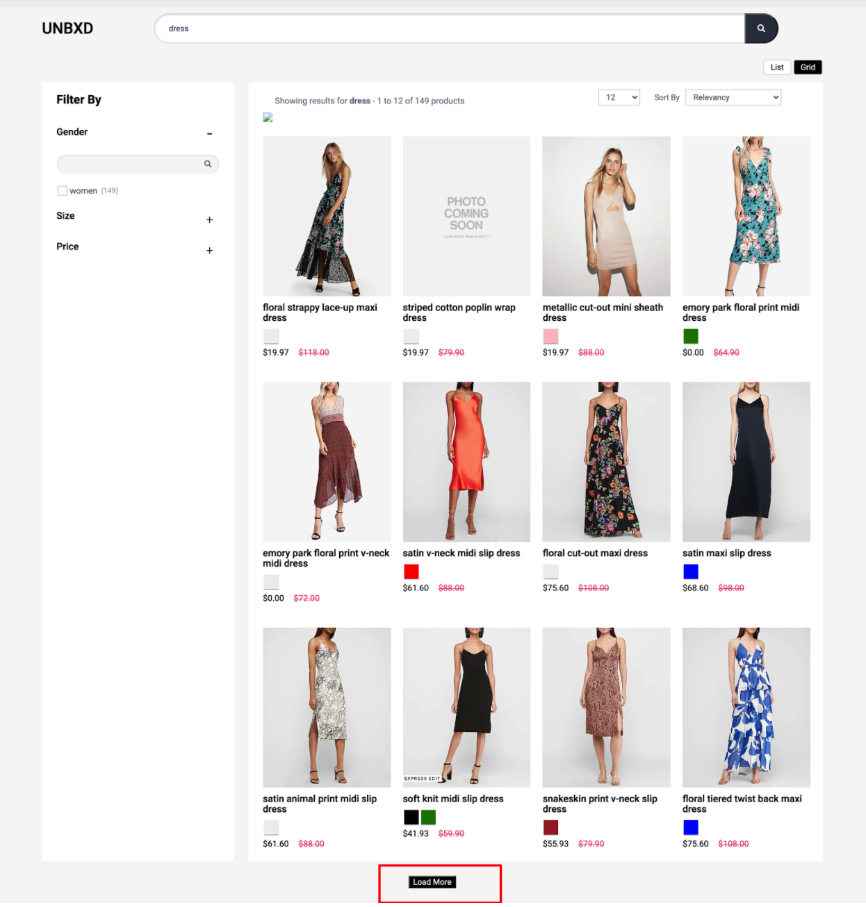
Before we delve into the next set of configs, let’s first understand the most common sections in a search results page or category landing page. A search results page or a category landing page is made up of the following set of sections:
- Products list section
- View type could be grid or list view
- Sort by widget
- Pagination widget with no. of products per page control
- Pagination could be an infinite scroll or page number based
- Number of results loaded on a page
- Facets section
- Spell check/search results message section
- Merchandising banners section
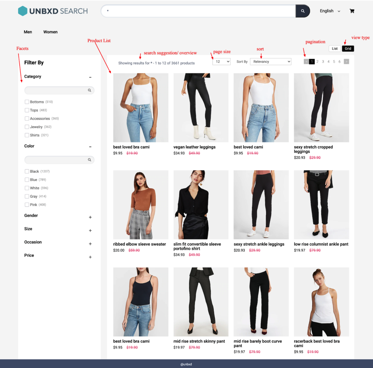
View Different Sections on a Search Result Page
In the following sections, we will discuss how to configure and render each feature with the Unbxd Search JS Library.
Search input box & search button selector
The library uses the following two configurations to bind keyboard and mouse events to the search input field and search button on your website.
| Property | Data Type | Required | Default | Description |
|---|---|---|---|---|
| searchBoxEl | Element | true | NA | DOM element for the search input box. Used by the library to bind keyboard input events. |
| searchButtonEl | Element | false | NA | DOM element for the search button. Used by the library to bind mouse click events. |
At the end of this step, you should have configured the “input” & “search button” as shown below:
window.unbxdSearch = new UnbxdSearch({
siteKey: "<your site key>",
apiKey: "<your API key>",
searchBoxEl: document.getElementById("unbxdInput"),
searchButtonEl: document.getElementById("searchBtn"),
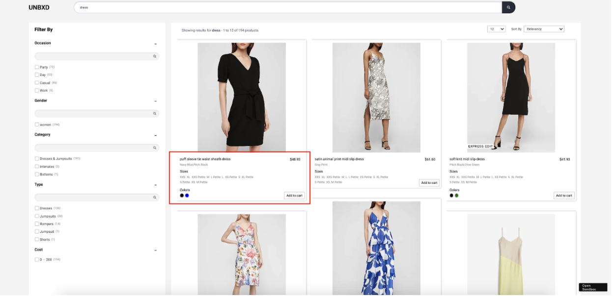
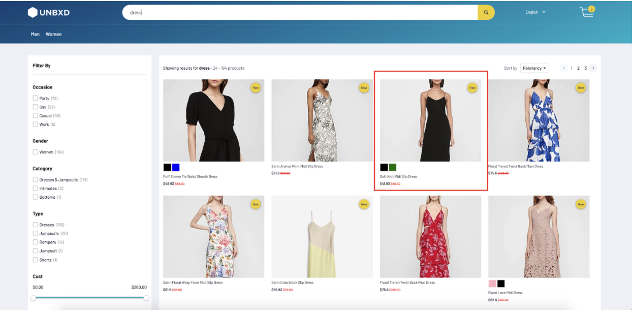
});Search Results/Product Options
This is where products from the search results will be rendered.
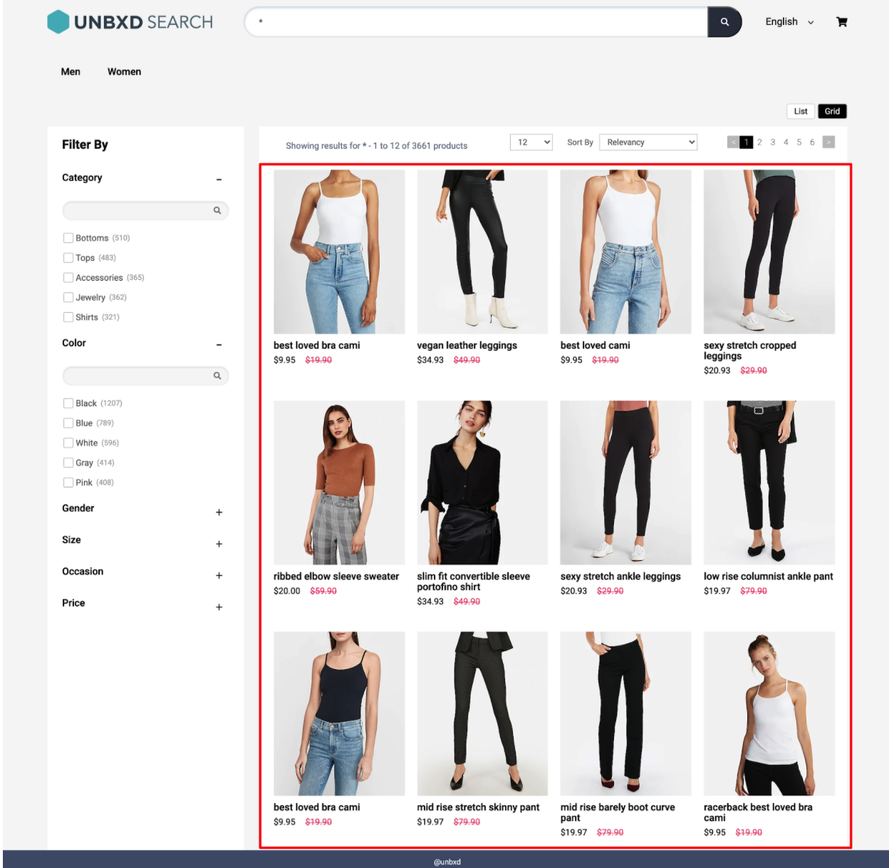
Configure the Search Results Section
| Option | Datatype | Default Value | Description |
|---|---|---|---|
productType | String | "SEARCH" | Type of products page to render. Accepted values: SEARCH, BROWSE, or CATEGORY. |
el | Element | null | Element in which to render the search results. |
template | Function | default | Customize the product card by returning custom HTML. Parameters: (product object, index, swatches, view type, product config). |
productAttributes | Array | ["title", "uniqueId", "price", "sku", "imageUrl", "displayPrice", "salePrice", "sortPrice", "productDescription", "unbxd_color_mapping", "colorName", "color"] | Required fields to generate the product result template. Helps improve result loading performance. |
attributesMap | Object | {"unxTitle": "title", "unxImageUrl": "imageUrl", "unxPrice": "salePrice", "unxStrikePrice": "displayPrice", "unxId": "uniqueId", "unxDescription": "productDescription"} | Maps field names for displaying product data in the card. |
gridCount | Number | Adjusts as per screen size | Defines how many product columns to show per row. Adjusts automatically if not set. |
productItemClass | String | "product-item" | Additional CSS class added to each product card. |
onProductClick | Function | function(product, event) {} | Callback triggered on product card click. Receives product and event as parameters. |
Sample “products” config:
products:{
       el: document.getElementById("searchResultsWrapper"),
       template:function(product,idx,swatchUI,productViewType){ return ``},
       productType:"SEARCH",
       gridCount:1,
       onProductClick: function(product,e) {
       },
       productAttributes: [
           "title",
           "uniqueId",
           "price",
           "sku",
           "imageUrl",
           "displayPrice",
           "salePrice",
           "sortPrice",
           "productDescription",
           "unbxd_color_mapping",
           "colorName",
           "color"
       ],
       attributesMap:{
           'unxTitle':'title',
           'unxImageUrl':'imageUrl',
           'unxPrice':'salePrice',
           'unxStrikePrice':'displayPrice',
           'unxId':'uniqueId',
           'unxDescription':'productDescription'
       }

   },
Read more about product configuration here.
Sort Options
Sorting allows you to rearrange the search results based on certain fields in a particular order.
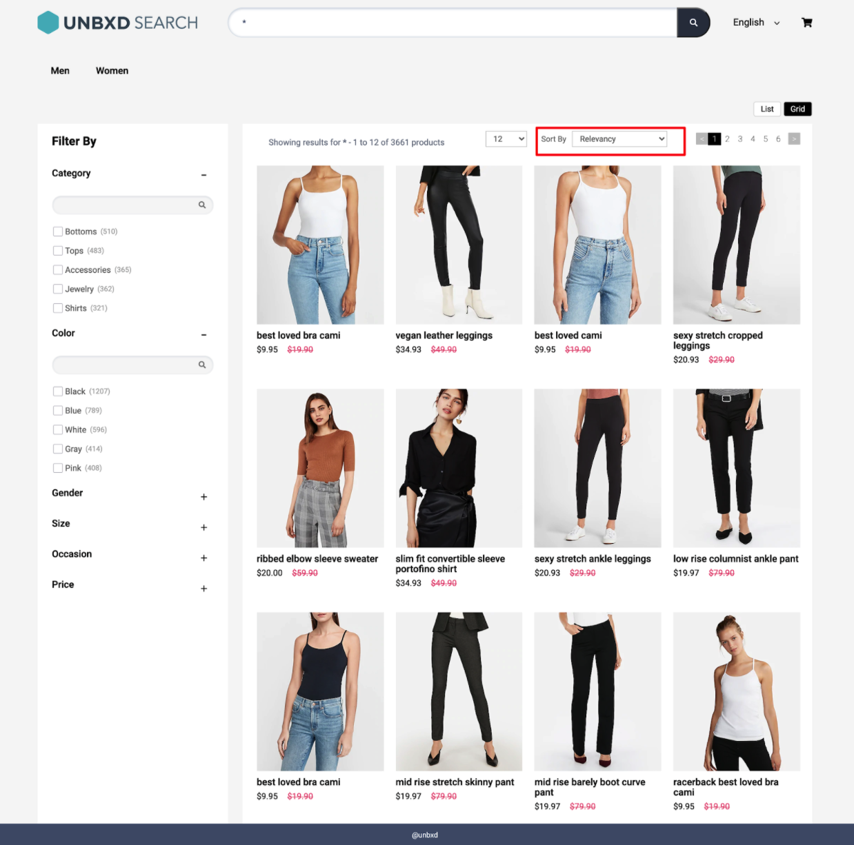
Rearrange the Search Results with Sort Option
To render the Sort By feature, you must configure the sort config object. The following are the various options available under the object:
| Option | Datatype | Default Value | Description |
|---|---|---|---|
enabled | Boolean | true | Set to false to disable the sort component. |
el | Element | null | Element in which to render the sort component. |
options | Array | [ {value: "price desc", text: "Price High to Low"}, {value: "price asc", text: "Price Low to High"}, {value: "rating asc", text: "Rating Low to High"}, {value: "rating desc", text: "Rating High to Low"} ] | Array of sort options available to the user. |
sortClass | String | "UNX-sort-item" | CSS class name applied to each sort item. Must be used in your template. |
selectedSortClass | String | "UNX-selected-sort" | CSS class name applied to the selected sort item. |
template | Function | default | Customize the sort UI using this function. Receives two parameters: selected sort value and the entire sort config object. |
action | String | "change" | Event type to trigger sort: either "click" or "change". |
Sample “sort” config
sort: {
   el: document.getElementById("sortWrapper"),
   selectedSortClass:'UNX-selected-sort',
   sortClass:'UNX-sort-item',
   template: function(selectedSort, sortConfig) { return ``},
   options:[{
        value:"price desc",
        text:"Price High to Low"
    },
    {
        value:"price asc",
        text:" Price Low to High"
    }],
   action:'change'
},
Please find the complete documentation here.
Pagination
Pagination helps to control the number of products displayed on the page and the type of pagination (infinite scroll, click to scroll, or fixed pagination) to display.
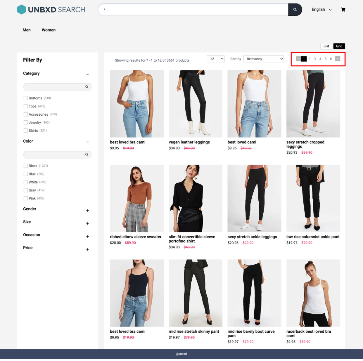
Control the Number of Products On One Page
Fixed Pagination: This traditional type of pagination displays the set number of products on one page.
Click & Scroll
You can configure the pagination feature by updating the required configs under the “pagination” config object.
The following are the various options available under the “pagination” config object:
| OPTION | DATATYPE | DEFAULT VALUE | DESCRIPTION |
|---|---|---|---|
enabled | Boolean | true | Turn this off if you do not want the pagination widget |
type | String | "CLICK_N_SCROLL" | Type of pagination: "FIXED_PAGINATION", "INFINITE_SCROLL", or "CLICK_N_SCROLL" |
el | Element | null | Element in which to render the pagination component |
template | Function | default | Custom HTML string returned from a function that receives pagination info |
pageClass | String | "UNX-page-items" | CSS classname for the pagination component |
selectedPageClass | String | "UNX-selected-page-item" | CSS classname for the selected page item |
onPaginate | Function | (paginationInfo){} | Callback function called after a pagination action |
pageLimit | Number | 6 | Number of pages to show upfront (for "FIXED_PAGINATION" type) |
infinteScrollTriggerEl | Element | window | Element to detect infinite scroll boundary (when type is "INFINITE_SCROLL") |
heightDiffToTriggerNextPage | Number | 100 | Height difference to trigger next page fetch (for "INFINITE_SCROLL" type) |
action | String | "click" | Action on which pagination should trigger: "click" or "change" |
sample
pagination : {
       enabled:true,
       el: document.querySelector("#clickScrollContainer"),
       template: function (paginationData, pagination) { return ``},
       pageClass:"UNX-page-items",
       selectedPageClass:"UNX-selected-page-item",
       type:'CLICK_N_SCROLL', // INFINITE_SCROLL or CLICK_N_SCROLL or FIXED_PAGINATION
       infinteScrollTriggerEl:window, //if paginationType = INFINITE_SCROLL
       heightDiffToTriggerNextPage:100, //if paginationType = INFINITE_SCROLL,
       onPaginate:function(paginationInfo){},
       action:'click',
       pageLimit:6
   }
Facets
Facets are the product filters provided on your webpage, allowing customers to narrow down the search result set.
To render the facets on the search results page, you can use the “facet” config object to configure the various options.
| OPTION | DATATYPE | DEFAULT VALUE | DESCRIPTION |
|---|---|---|---|
facetsEl | Element | null | Element in which to render the facets |
facetTemplate | Function | default | Customize entire facets block (receives: full block, facet values, isExpanded, search text) |
facetItemTemplate | Function | default | Customize each individual facet item (receives: full block, facet value, search text) |
facetMultiSelect | Boolean | true | Set to false to disable multiple facet selection |
facetClass | String | "UNX-facets-block" | CSS class for facet block |
facetAction | String | "click" | Event type for selection: "click" or "change" |
selectedFacetClass | String | "UNX-selected-facet-btn" | CSS class for selected facet items |
selectedFacetsEl | Element | null | Element to render selected facets (falls back to rendering alongside facets if null) |
selectedFacetTemplate | Function | default | Customize selected facet block (receives: full block, selected value) |
selectedFacetItemTemplate | Function | default | Customize selected facet item (receives: full block, selected value) |
clearAllText | String | "Clear All" | Text for "clear all" button |
rangeTemplate | Function | default | Customize range facets (receives: range list) |
rangeWidgetConfig | Object | NA | Range slider config (see "Facet Range Widget Config") |
facetMultilevel | Boolean | true | Enables multilevel facets in API |
facetMultilevelName | String | "Category" | Field name for multilevel facet |
multiLevelFacetSelectorClass | String | "UNX-multilevel-facet" | CSS class for multilevel facet items |
multiLevelFacetTemplate | Function | default | Customize multilevel facet (receives: full block, selected values, search text) |
facetDepth | Number | 4 | Number of category levels to support |
clearFacetsSelectorClass | String | "UNX-clear-facet" | Class for clear selected facets button |
removeFacetsSelectorClass | String | "UNX-remove-facet" | Class for delete individual facet button |
onFacetLoad | Function | function(facets) {} | Callback after facet selection/deselection |
applyMultipleFilters | Boolean | false | Enables "apply all filters together" functionality |
applyButtonText | String | "Apply" | Label for apply button |
clearButtonText | String | "clear" | Label for clear button |
isCollapsible | Boolean | true | Enables collapsible accordion-style facets |
defaultOpen | String | "ALL" | For collapsible facets: "ALL", "FIRST", or "NONE" as default open state |
isSearchable | Boolean | true | Enable search inside facet blocks |
searchPlaceHolder | String | "" | Placeholder text for facet search input |
enableViewMore | Boolean | false | Enables "view more/less" toggle for long facet lists |
viewMoreText | Array | ["show all", "show less"] | Texts for view more / less toggle |
viewMoreLimit | Number | 3 | Min facet value count to show view more |
Facet Range Widget Config
You can configure the range sliders by setting the “rangeWidgetConfig” object under the “facet” object. Range facets will be rendered automatically along with other facets if it is configured on the console dashboard.
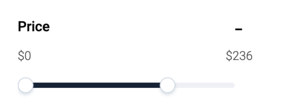
The following are the various options available for configuring the range widget
| OPTION | DATATYPE | DEFAULT VALUE | DESCRIPTION |
|---|---|---|---|
minLabel | String | "" | Text label for the lower end of the range slider |
maxLabel | String | "" | Text label for the higher end of the range slider |
prefix | String | "$" | Prefix for the range values (e.g., $ for price range display like $10) |
Sample
 facet: {
       facetsEl: document.getElementById("facetsWrapper"),
       facetTemplate:function(facetObj, children, isExpanded,facetSearchTxt, facet){},
       facetItemTemplate:function(facet,value, facetSearchText){},
       facetMultiSelect:true,
       facetClass:"UNX-facets-block",
       facetAction:"click",
       selectedFacetClass:"UNX-selected-facet-btn",
       selectedFacetsEl:null,
       selectedFacetTemplate:function(selections, facet){},
       selectedFacetItemTemplate:function(selectedFacet,selectedFacetItem){},
       clearAllText:"Clear All",
       rangeWidgetConfig: {
           "minLabel":"",
           "maxLabel":"",
           "prefix":'$'
       },
       facetMultilevel:true,
       facetMultilevelName:"Category",
       multiLevelFacetSelectorClass:"UNX-multilevel-facet",
       facetDepth:4,
       clearFacetsSelectorClass: "UNX-clear-facet",
       removeFacetsSelectorClass: "UNX-remove-facet",
       onFacetLoad:function(facets){
       },
       applyMultipleFilters:false,
       applyButtonText:"Apply",
       clearButtonText:"clear",
       isCollapsible:true,
       isSearchable:true,
       searchPlaceHolder:"",
       textFacetWrapper:"UNX-facets-item",
       defaultOpen:"ALL",
       enableViewMore:false,
       viewMoreText:["show all", "show less"],
       viewMoreLimit:3
   }
Page Size
Page Size widget allows you to configure the number of products on each page.
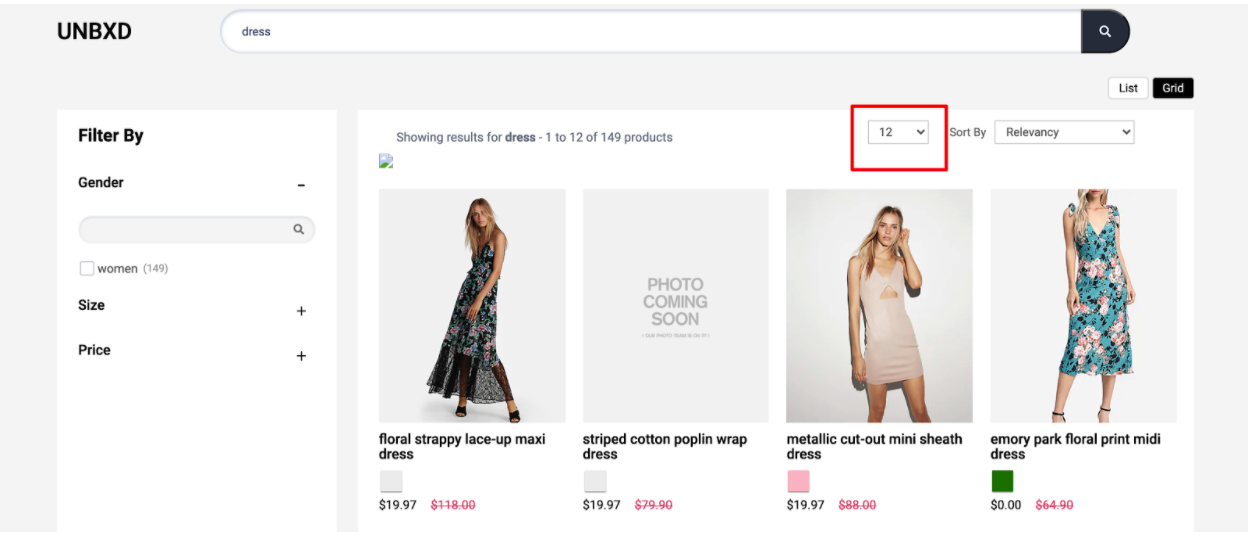
Configure the no. of Products on Each Page
To render the Page Size widget, you need to configure the “pageSize” config object.
The following are the various options available under the object:
| OPTION | DATATYPE | DEFAULT VALUE | DESCRIPTION |
|---|---|---|---|
enabled | Boolean | true | Turn this off to disable the page size selection component |
el | Element | null | Element in which to render the page size control |
pageSize | Number | 12 | Default number of results shown per page |
options | Array | [8, 12, 16, 20, 24] | List of selectable page sizes. Recommended to align with column count (e.g., for 3-column layout use multiples like 15, 18, 21) |
pageSizeClass | String | "UNX-pagesize" | CSS class to apply to the page size element |
selectedPageSizeClass | String | "UNX-selected-pagesize" | CSS class to apply to the selected page size option |
action | String | "change" | Event type to trigger page size change: "click" or "change" |
template | Function | default | Function to customize the HTML template of the component. Receives two parameters: the selected page size and the full config object |
Sample
pageSize: {
  enabled:true,
       pageSize:12,
       options:[8,12,16,20,24],
       pageSizeClass:"UNX-pagesize",
       selectedPageSizeClass:"UNX-selected-pagesize",
       action:'change',
       template:function(){},
       el:null
   }
Product View
You can configure the way in which the products have to be displayed (List or Grid) with the Product Views widget.
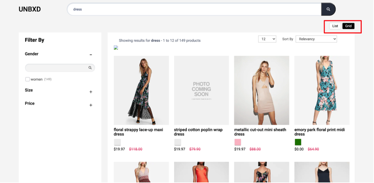
Configure the Way Your Products are Displayed
Update the options under the “productView” config object to configure the product view feature.
| OPTION | DATATYPE | DEFAULT VALUE | DESCRIPTION |
|---|---|---|---|
enabled | Boolean | true | Turn this off to disable the product view switcher component |
el | Element | null | Element in which to render the product view type component |
template | Function | default | Custom function to render product view HTML. Receives 2 parameters: selected view type and full config object |
defaultViewType | String | "GRID" | Default product view type. Accepts "LIST" or "GRID" |
action | String | "click" | Event type to switch product view: "click" or "change" |
viewTypeClass | String | "UNX-product-view" | CSS class to apply to each product view option |
selectedViewTypeClass | String | "UNX-selected-product-view" | CSS class to apply to the currently selected product view option |
Sample “productView” config
productView : {
  enabled:true,
       el:null,
       template:renderProductViewType,
       action: “click”, // CLICK or CHANGE
       viewTypeClass: “UNX-product-view”,
       selectedViewTypeClass: “UNX-selected-product-view”,
       viewTypes: “GRID”
   }
Spellcheck & Search Query
The spell check feature provides spelling suggestions or spell-checks for misspelled search queries.
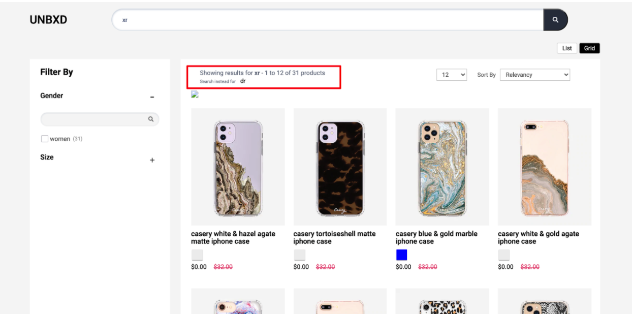
Give Spell-Checks for Misspelled Search Queries
In such cases, Unbxd's context-aware algorithm understands your visitor’s intent and sends a “Did You Mean” response along with a search result set for the query, if any.
You can configure the spellcheck feature by updating the required configs under the “spellCheck” config object.
| OPTION | DATATYPE | DEFAULT VALUE | DESCRIPTION |
|---|---|---|---|
enabled | Boolean | true | Enables or disables the spell check component |
el | Element | null | Element in which to render the spell check component |
template | Function | default | Function to customize the spell check UI. Receives 3 parameters: the search query, suggested query text, and a config object {start, productsLn, numberOfProducts} |
selectorClass | String | "UNX-suggestion" | Additional CSS class name applied to the spell check component |
Sample “spellCheck” config
spellCheck:{
       enabled:true,
       el:document.getElementById("didYouMeanWrapper"),
       template: function(query,suggestion,pages) { return ``},
       selectorClass: "UNX-suggestion"
   }
Breadcrumbs
To render the breadcrumb component, set the “breadcrumb” config object.
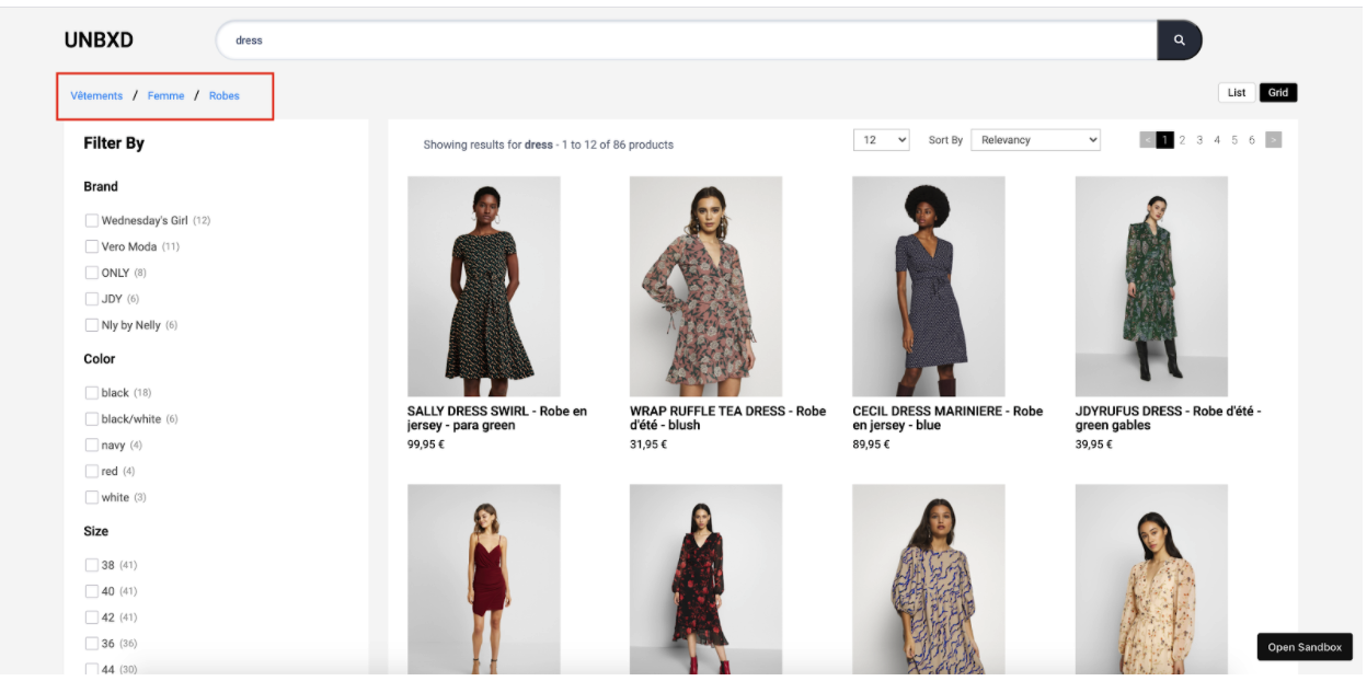
The following options are available under the object:
| OPTION | DATATYPE | DEFAULT VALUE | DESCRIPTION |
|---|---|---|---|
enabled | Boolean | true | Enables or disables the breadcrumb component |
el | Element | null | Element in which to render the breadcrumbs |
template | Function | default | Function to customize breadcrumb HTML. Receives the breadcrumb list as parameter |
selectorClass | String | "bread-crumb" | CSS class to apply to each breadcrumb item |
Variants
Configure variants display by setting the “variants” config object.
The following options are available under the object:
| OPTION | DATATYPE | DEFAULT VALUE | DESCRIPTION |
|---|---|---|---|
enabled | Boolean | false | Set this flag to true to enable variant rendering |
count | Number | 5 | Number of variants to be shown |
groupBy | String | "v_colour" | Field name (as per catalog) to group the variants by (e.g., "v_colour", "v_size", etc.) |
attributes | Array | ["title", "v_imageUrl"] | Array of catalog fields to include in each variant |
mapping | Object | { "image_url": "v_imageUrl" } | Field mapping from catalog attributes to variant attributes, required for correct rendering |
Sample “variants” config
variants:{
        enabled:false,
        count:5,
        groupBy:'v_colour',
        attributes:[
            "title",
            "v_imageUrl"
        ],
        mapping:{
            "image_url":"v_imageUrl"
        }
    },
Swatches
Configure swatches display by using the configs in this section.
The following options are available under the object:
| OPTION | DATATYPE | DEFAULT VALUE | DESCRIPTION |
|---|---|---|---|
enabled | Boolean | false | Enables or disables the swatches component |
attributesMap | Object | { swatchImgs: "unbxd_color_mapping", swatchColors: "color", swatchList: "color" } | Field mappings from catalog to swatch attributes (e.g., color images, color names, list of colors) |
swatchClass | String | "UNX-swatch-btn" | CSS class to apply to swatch buttons |
template | Function | default | Function to customize the swatch UI. Receives two parameters: the current swatch data and the complete swatches list |
Sample “swatches” config
swatches:{
       enabled:true,
       attributesMap:{},
       swatchClass:'UNX-swatch-btn',
       template:function(swatchData) {
           const {
               swatchColors = [],
               swatchImgs = []
           } = swatchData;
           let btnUI = ``;
           swatchColors.forEach((item,id) => {
               const imgId = swatchImgs[id];
               if(imgId){
                   const img = imgId.split("::")[1];
                   btnUI+= [`<button data-swatch-id="${item}" data-swatch-img="${img}" data-action="changeSwatch"`,
 `data-swatch-target=".UNX-img-block" class="${this.swatchClass}" style="background-color:${item}"> </button>`].join('')
               }
           });
           return `<div class="UNX-swatch-color-list">${btnUI}</div>`;
       }
   }
NOTEIf you wants swatches, variants count should be higher, and “groupBy” field should be present in mapped fields config as shown below
variants:{
       enabled:false,
       count:5,
       groupBy:'v_colour',
       attributes:[
           "title",
           "v_imageUrl"
       ],
       mapping:{
           "image_url":"v_imageUrl"
       }
   }
Banner
Configure the banner display by setting the “banner” config object.
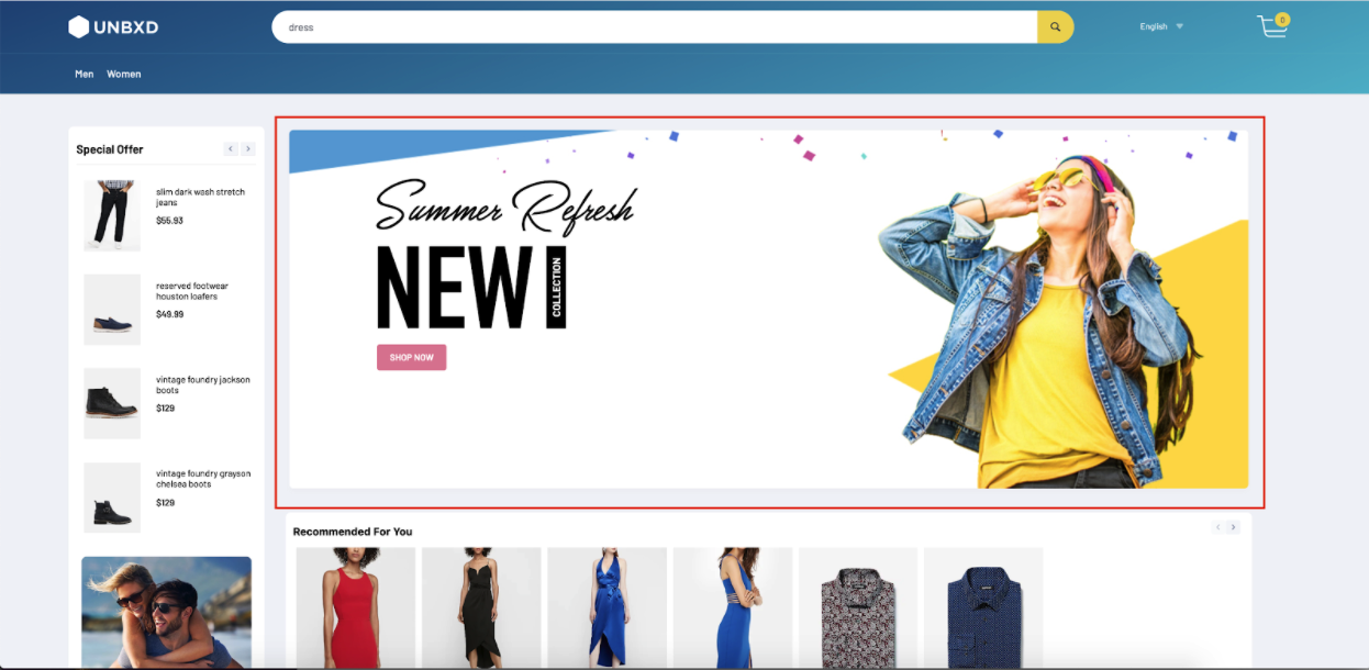
The following options are available under the object:
| OPTION | DATATYPE | DEFAULT VALUE | DESCRIPTION |
|---|---|---|---|
enabled | Boolean | false | Enables or disables the banner component |
el | Element | null | Element in which the banner component will be rendered |
template | Function | [default](https://github.com/unbxd/search-JS-library/blob/master/src/modules/banners/index.js) | Custom function to define the banner’s HTML. Receives list of banners as parameter |
count | Number | 1 | Number of banners to be displayed |
Loader
Configure page loader to be shown when fetching search API results by setting the “loader” config object.
The following options are available under the object:
| OPTION | DATATYPE | DEFAULT VALUE | DESCRIPTION |
|---|---|---|---|
el | Element | null | Element in which to render the loader component |
template | Function | function(){ return '<div class="UNX-loader">Loading search results….</div>'; } | Function to customize the loader UI. Should return HTML string for the loading indicator |
NoResults
Configure the display to be rendered when there are no results by setting the “noResults” config object.
The following options are available under the object:
| OPTION | DATATYPE | DEFAULT VALUE | DESCRIPTION |
|---|---|---|---|
template | Function | function(query){ return '<div class="UNX-no-results"> No Results found ' + query + '</div>'; } | Function to customize the UI when no results are found. Receives the search query as the input parameter |
Miscellaneous Configs
| OPTION | DATATYPE | DEFAULT VALUE | DESCRIPTION |
|---|---|---|---|
siteKey | String | NA | Unique Site Key assigned by Unbxd (from the console dashboard). Refer to this section for steps to get the Site Key for your account. |
apiKey | String | NA | Unique API Key assigned by Unbxd (from console dashboard). Refer to this section for steps to get the Site Key for your account. |
searchBoxEl | Element | null | DOM element selector for the search input box |
searchButtonEl | Element | NA | DOM element selector for the search button. Clicking it triggers a search based on searchBoxEl value |
unbxdAnalytics | Boolean | false | Enables Unbxd Analytics event tracking (requires including Unbxd Analytics SDK) |
hashMode | Boolean | false | Enables URL updates using hash (#) instead of query parameters |
updateUrls | Boolean | true | Controls whether URLs update on search parameter change |
actionBtnClass | String | "UNX-action-item" | CSS class for elements that trigger click events |
actionChangeClass | String | "UNX-action-change" | CSS class for elements that trigger change events |
onAction | Function | function(event, context) {} | Callback on custom click or change event. Receives: event, context |
onEvent | Function | function(context, type) {} | Callback for supported Unbxd lifecycle events. Event types: BEFORE_API_CALL, AFTER_API_CALL, BEFORE_RENDER, AFTER_RENDER, BEFORE_NO_RESULTS_RENDER, AFTER_NO_RESULTS_RENDER, FACETS_CLICK, DELETE_FACET, PAGE_NEXT, etc. |
extraParams | Object | { "version": "V2" } | Additional custom parameters to include in search API calls |
productId | String | "uniqueId" | Field representing the unique product identifier |
defaultFilters | Object | null | Set default filters to be applied with every API request |
searchQueryParam | String | "q" | Custom query param name to send search term (e.g., "query" instead of "q") |
searchEndPoint | String | "https://search.unbxd.io" | The domain name of the Unbxd search endpoint |
searchPath | String | "" | Additional path to append to search URL (useful for SPAs or subpaths) |
getCategoryId | Function | null | Custom function to return category ID (default comes from unbxdPageConf) |
setCategoryId | Function | null | Custom function to define logic for category navigation via breadcrumbs |
Instance Methods
This section documents the different methods exposed by the Library that you can use to perform various actions.
NoteAll the below methods can be called on the instance object returned by UnbxdSearch constructor.
updateConfig
| Function | Purpose | Arguments | Usage Example |
|---|---|---|---|
updateConfig(configObj) | Dynamically update the config object; merges with existing settings | configObj (Object) | unbxdSearch.updateConfig({ sort: { el: document.getElementById("sortWrapper"), options: [{ value: "sortPrice desc", text: "Price High to Low" }, { value: "sortPrice asc", text: "Price Low to High" }] }}) |
getResults() | Refetch search results for a given query | query (String) | unbxdSearch.getResults("dress") |
getCategoryPage() | Render category page results | None | unbxdSearch.getCategoryPage() |
getBrowsePage() | Render browse page results | None | unbxdSearch.getBrowsePage() |
reRender() | Re-render UI components, useful on layout or screen changes | None | unbxdSearch.reRender() |
resetFacets() | Manually reset all selected facets | None | unbxdSearch.resetFacets() |
resetAll() | Reset entire search state (facets, sort, pagination, etc.) | None | unbxdSearch.resetAll() |
setPageStart(pageNo) | Set specific page number to start from | pageNo (Number) | unbxdSearch.setPageStart(1) |
setRangeSlider(config) | Update range slider filter manually | { start, end, facetName, gap } | unbxdSearch.setRangeSlider({ start: 0, end: 573, facetName: "price", gap: 200 }) |
For any issue that you face during integration or need updates on the changes, follow these tips, raise issues, or track log changes.
Tips & Tricks
- If you are including our Search JS Library, Autosuggest Library & Analytics Library in your HTML page, the order of the files is important.
- Include the Search JS Library, followed by Autosuggest Library and the Analytics JS Library. The code to invoke the library should follow.
- Always ensure you are invoking the library (i.e., calling the UnbxdSearch constructor) after you have included it either via URL or via npm
- Include the CSS inside the <head> tag of your HTML page & the scripts at the end of the body tag. This will ensure that the page rendering is not blocked by the JavaScript files.
Raise Issues
Facing some issues? Look for solutions or create an issue here.
Stay up to date
Look at the changelog to see the latest version & history.
List of available Configurations
You can find the list of the available configurations in this Github link.