React SDK
Overview
Unbxd Search React SDK helps you integrate Unbxd search and its functionalities within your React Application.
With a few simple configurations, you can quickly get up and running with our default template to experience the Unbxd Search functionalities.
Through this documentation, you will generate a search page template and make corresponding changes to the SDK configuration to render the appropriate UI components.
VersionThe current version is v1.0.1.
Integrate with Unbxd Template
To set up Unbxd Search React App quickly, integrate our default search template using our generator package create-unbxd-search-app with your site key and API key as configs.
Follow these steps to integrate the default Unbxd template:
- Open the terminal and run the command:
npx @unbxd-ui/create-unbxd-search-app --siteKey --apiKey This sets up a sample Unbxd Search project so that you can explore Unbxd Search.
Note
- Refer to this section for steps on how to get the Site Key & API Key for your account
Also, if you do not already have npx installed, type this command to install it:
npm install -g npx- Set the dimension mapping for the attributes of your catalog.
Navigate to the Manage > Configure Site page in your console dashboard to set up dimension mapping of the catalog attributes to Unbxd fields.
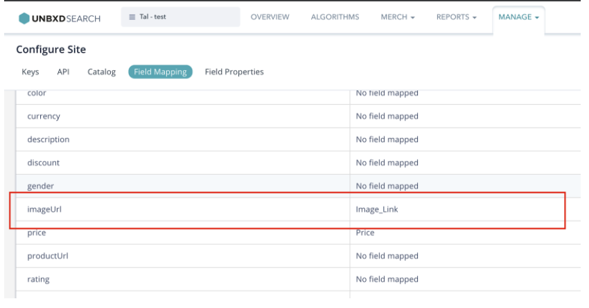
Field Mapping
Then, update the same in unbxd-search.config.json, which is present on the root level of the newly created React App. For example, if you have mapped “imageUrl” to “Image_Link” as shown above, then update the same in the JSON file like below:
//unbxd-search.config.json
 {
  ...
"attributesMap": {
       "productName": "title",
       "uniqueId": "uniqueId",
       "imageUrl": "Image_Link",
       "price": "price",
       "sellingPrice": "selling_price",
       "productUrl": "productUrl"
     }
   ...

}- Finally, run the React app to experience the Unbxd search for your site. On the root directory of the project run any of the below commands based on your preferred package manager:
yarn startIntegrate Your Site
To integrate the React Search SDK into your existing app, follow the steps below:
- Add the react-search-sdk as a dependency in your project:
yarn add @unbxd-ui/react-search-sdk- Import UnbxdSearchWrapper into your app as mentioned below:
import UnbxdSearchWrapper from “@unbxd-ui/react-search-sdk”;- Include the UnbxdSearchWrapper component by initializing it with your Site key and API key as props as mentioned below:
 <UnbxdSearchWrapper siteKey={<site key>} apiKey={<api key>}>
  ...
  <OtherComponents/>
  ...
</UnbxdSearchWrapper/>- Import & include the rest of the components (like products, sort, pagination, etc.) based on your preferences.
You can import the required components as mentioned below:
import {Products, Sort, Pagination } from ‘@unbxd-ui/react-search-sdk’;Imported Search React SDK components can be passed as children to UnbxdSearchWrapper component as mentioned below:
 <UnbxdSearchWrapper siteKey={<site key>} apiKey={<api key>}>
   ...
   <Products {...props}/>
   <Sort {...props}/>
   <Pagination {...props}/>
  ...
 </UnbxdSearchWrapper/>
NOTEThe imported components have to be wrapped by UnbxdSearchWrapper, which ensures that the Unbxd Search Context is being passed down to all the components.
Installation
Here, we will learn how to integrate the Unbxd Search React SDK to optimize and power your site's search results display page. The integrated result we aim for with this quickstart can be seen at the codesandbox link.
Let us walk through the essential configurations and available components that need to be passed to power the search results page.
Note: You can find a detailed list of all the components here.
Refer to the “Quick Integration with your site” section above for steps to install and import the desired components.
Authentication
Once installed, you need to authenticate the Unbxd library using your Unbxd account keys (also known as Authentication Keys).
Whenever a customer signs up with Unbxd, they are issued one or more site keys and API keys depending on their use case. Some common scenarios:
For a customer with one website and two environments (production and staging), 2 site keys (one for each environment) and 1 API key is issued
For a customer with more than one website (multi website vendor), the site key would be issued for every website + environment combination. So there would be an “n” number (equal to the number of website’s) of API keys generated.
For multiple site keys, check if you have:
- more than one environment
- more than one website
- a different product set for staging and live, or
- wish to track search performance and clicks separately for every microsite.
To get your Site Key and API Key in the console, please refer to the steps mentioned in the Help Documentation.
Pass the Site Key and API Key that you get from the console in the “siteName” and “APIKey” configs.
 <UnbxdSearchWrapper siteKey={<site key>} apiKey={<api key>}>
   ...
   <OtherComponents/>
   ...
 </UnbxdSearchWrapper/>
Types of pages to render
This section allows you to indicate the product types available in your catalog while excluding specific categories of products while synchronizing.
Unbxd has two product offerings:
- Search: used to power search results pages
- Browse: powers category listing pages
Pass a prop productType to UnbxdSearchWrapper component to indicate whether you want to render the search results page (productType= ‘SEARCH’) or the category listing page (productType=’CATEGORY’).
The default value of productType is ‘SEARCH’. If UnbxdSearchWrapper has to be configured for a CATEGORY page, pass productType as ‘CATEGORY’ and also pass getCategoryId.
UnbxdSearchWrapper Props
| Prop | Description | Data Type | Required | Default |
|---|---|---|---|---|
siteKey | Site key of the site. | string | true | – |
apiKey | API key of the site. | string | true | – |
getCategoryId | Custom function to return the Category ID. <br>(Mandatory if productType is CATEGORY.) | function | false | – |
productType | Product type: SEARCH or CATEGORY. | string | false | 'SEARCH' |
priceUnit | Currency type of the catalog. | string | false | '$' |
At the end of this step, you should have configured UnbxdSearchWrapper like mentioned below.
 } apiKey={}
    productType={“CATEGORY”}
    getCategoryId={()=>{}}>
    ...

    ...
 </UnbxdSearchWrapper/>
Configuring the page
Before we delve into the next set of components, let’s first understand the most common sections present in a search results page or category landing page.A search results page or a category landing page is made up of the following set of sections:
- Products list section
- View type of module with support for grid or list view
- Sort by module
- Pagination module with no. of products per page control
- Pagination could be infinite scroll or page number based
- Facets section
- Spell check / search results message section
- Merchandising banners section
In the following sections, we will discuss how to configure and render each of these sections with the React Search SDK.
Search box: A module to enter the search query.
The component contains input and a submit button by default. SearchBox can be further customized by passing a custom Input component, Submit a component according to your needs.
SearchBox Props
| Prop | Description | Data Type | Required | Default |
|---|---|---|---|---|
autoFocus | Should the search input be focused. | bool | false | false |
clearable | Should the search input be clearable. | bool | false | false |
onSubmit | Callback called when search is triggered. Should return true to continue the search, false to cancel. | function | false | – |
onClear | Callback called when clear is triggered. Should return true to clear input, false otherwise. | function | false | – |
showLoader | Should loader be shown on search. | bool | false | – |
inputComponent | Custom input component instance. | element | false | – |
submitComponent | Custom submit component instance. | element | false | – |
clearComponent | Custom clear component instance. | element | false | – |
placeholder | Search input placeholder text. | string | false | – |
At the end of this step, you should have configured the SearchBox component like shown below:
 <UnbxdSearchWrapper siteKey={<site key>} apiKey={<api key>}
    ...
    <SearchBox
    ...
    autoFocus={true}
    clearable={true}
    ...
 />
    ...
 </UnbxdSearchWrapper/>
Products
A module to handle the rendering of the products.
The module requires a dimension map of the attributes to render the products on the UI. The mapping can be defined as mentioned below:
const attributesMap = {
  productName: “title”,
  uniqueId: “uniqueId”,
  imageUrl: “imageUrl”,
  price: “default_price”,
  sellingPrice: “cheapest_price”
 }
The variants of a product will not be grouped together by default. To enable grouping of variants, pass showVariants as true. Variants require a mapping of their own. The mapping can be defined as mentioned below.
const variantAttributesMap = {
  productName: “v_title”,
  uniqueId: “v_uniqueId”,
  imageUrl: “v_imageUrl”,
  price: “v_default_price”,
  sellingPrice: “v_cheapest_price”
 }
Apart from handling the number of products per row and the total number of products per page, we can also handle the pagination type of products. The module supports infinite scroll, click and scroll and fixed pagination which can be controlled by paginationTypeprop.
Fixed Pagination
If paginationType is set to FIXED_PAGINATION, please include the Paginationcomponent which handles the navigation between pages.
Infinite Scroll
If paginationType is set to INFINITE_SCROLL, the scroll height difference to trigger the next page can be passed by heightDifferenceToTriggerNextPage prop.
Click And Scroll
If paginationType is set to CLICK_N_SCROLL, the module provides an inbuilt Load More component which can be overridden by passing a custom loadMoreComponent.
Product cards can be further customized by passing a custom productItemComponent to the module.
Products Props:
| Prop | Description | Data Type | Required | Default |
|---|---|---|---|---|
pageSize | Number of products to be loaded on a page. | number | false | 10 |
paginationType | Products displayed on a page. Possible options are INFINITE_SCROLL, CLICK_N_SCROLL, FIXED_PAGINATION. | string | false | FIXED_PAGINATION |
heightDiffToTriggerNextPage | Height difference to trigger for next page in case of pagination type INFINITE_SCROLL. | number | false | 100 |
loadMoreComponent | Custom component instance to load more products in case of CLICK_N_SCROLL. | element | false | – |
productIdAttribute | Unique ID of the product. | string | false | uniqueId |
attributesMap | Mapping of catalog Product fields to SDK’s Product fields. | object | true | – |
showVariants | Display if the product has other variants. | bool | false | false |
variantsCount | Number of variants to fetch. | number | false | 5 |
variantAttributes | Mapping of catalog Product variant fields to SDK Product variant fields. | object | false | – |
showLoader | Should a loader be shown. | bool | false | false |
loaderComponent | Custom loader component. | element | false | default Loader |
onProductClick | Callback function triggered on click of a product. | function | false | – |
onZeroResults | Callback function triggered on zero results. | function | false | – |
showSwatches | Display a small color/image swatch for the product. | bool | false | – |
groupBy | Club variants together by the attribute. | string | false | – |
swatchAttributes | Swatch attributes that change on click of the swatch. | object | false | – |
swatchItem | Custom swatch component instance. | element | false | – |
productItem | Custom product item component instance. | element | false | – |
zeroResults | Custom zero results component instance. | element | false | – |
At the end of this step, you should have configured the Products component as shown below:
 <UnbxdSearchWrapper siteKey={<site key>} apiKey={<api key>}
   ...
   <Product
   ...
   perRow={3}
   attributesMap={attributesMap}
   showVariants={true}
   variantsCount={2}
   variantAttributesMap={variantAttributesMap}
/>
   ...
 </UnbxdSearchWrapper/>
Text Facets
A module to display text based filters. For ex. brand, type, size, etc.
This module displays the text-based facets (like brand, type, size) that can be applied by the user for the better filtering of the products.
facetItemComponent
TextFacets can be further customized by passing a custom component instance.
const FacetItemComponent = ({ itemData, onClick }) => {
    const { name, count, isSelected } = itemData;
    const handleClick = () => {
        onClick(itemData);
    };

    return (
        <div
            className={`UNX-facet__item ${isSelected ? '-selected' : ''}`}
            onClick={handleClick}
        >
            <div className="-checkbox"></div>
            <div className="-label">{name}</div>
            <div className="-count">({count})</div>
        </div>
    );
};| Prop | Description | Data Type | Required | Default |
|---|---|---|---|---|
facetItemComponent | Custom facet item component instance | element | false | – |
Label | Label for the component | string | false | – |
At the end of this step, you should have configured the TextFacets component as shown below:
 <UnbxdSearchWrapper siteKey={<site key>} apiKey={<api key>}
  ...
  <TextFacets />
  ...
 </UnbxdSearchWrapper/
Range Facets
A module to display numerical facets. For ex. price.
This module displays the range facets that can be applied by the user for the better filtering of the products.
facetItemComponent
RangeFacets can be further customized by passing a custom component instance.
const FacetItemComponent = ({ itemData, onClick }) => {
    const { name, count, isSelected } = itemData;
    const handleClick = () => {
        onClick(itemData);
    };

    return (
        <div
            className={`UNX-facet__item ${isSelected ? '-selected' : ''}`}
            onClick={handleClick}
        >
            <div className="-checkbox"></div>
            <div className="-label">{name}</div>
            <div className="-count">({count})</div>
        </div>
    );
 };
RangeFacets Props:
| Prop | Description | Data Type | Required | Default |
|---|---|---|---|---|
facetItemComponent | Custom Facet item component instance | element | false | – |
Label | Label for the component | string | false | – |
At the end of this step, you should have configured the RangeFacets component as shown below:
 <UnbxdSearchWrapper siteKey={<site key>} apiKey={<api key>}
   ...
   <TextFacets />
   ...
 </UnbxdSearchWrapper/>
Multilevel Facets
A module to display hierarchical facets.
This module displays the multilevel facets that can be applied by the user for the better filtering of the products.
- facetDepth: Maximum depth of the category.
- facetLimit: Maximum number of values present in a facet.
- facetItemComponent:
MultilevelFacetscan be further customized by passing a custom component instance.
 const FacetItemComponent = ({ itemData, onClick }) => {
    const { name, count, level, isSelected } = itemData;
    const handleClick = () => {
        onClick(itemData);
    };
    return (
        <div
            className={`UNX-facet__item -l${level} ${
                isSelected ? '-selected' : ''
            }`}
            onClick={handleClick}
        >
           <div className="-checkbox"></div>
            <div className="-label">{name}</div>
            {count && <div className="-count">({count})</div>}
        </div>
    );
 };
MultilevelFacets Props:
| Prop | Description | Data Type | Required | Default |
|---|---|---|---|---|
facetDepth | Max sub-categories of a category. | number | false | 6 |
facetLimit | Maximum number of values present in a facet. | number | false | 100 |
facetItemComponent | Custom Facet item component instance. | element | false | – |
label | Label for the module. | string | false | – |
At the end of this step, you should have configured the TextFacets component as shown below:
 <UnbxdSearchWrapper siteKey={<site key>} apiKey={<api key>}
  ...
   <MultilevelFacets />
  ...
 </UnbxdSearchWrapper/>
Combined Facets
A module to display all the facets in their respective order .
This module displays all the facets in the intended order, that can be applied by the user for the better filtering of the products. The order of the facets can be configured on the console.
| Prop | Description | Data Type | Required | Default |
|---|---|---|---|---|
textFacetItemComponent | Custom Text Facet item component instance | element | false | – |
rangeFacetItemComponent | Custom Range Facet item component instance | element | false | – |
multilevelFacetItemComponent | Custom Multilevel Facet item component instance | element | false | – |
applyMultiple | Enable multiple range facets | bool | false | false |
onFacetClick | Callback for facet click | function | false | – |
label | Label for the module | string | false | – |
At the end of this step, you should have configured the CombinedFacets module like shown below:
 <UnbxdSearchWrapper siteKey={<site key>} apiKey={<api key>}
   ...
  <CombinedFacets />
  ...
 </UnbxdSearchWrapper/>
Selected Facets
A module to display selected facets.
This module displays the selected facets that can be removed by the user with ease.
facetItemComponent
SelectedFacets can be further customized by passing a custom component instance.
const FacetItemComponent = ({ itemData, onClick, priceUnit }) => {
    const { name, type, dataId } = itemData;
    const handleClick = () => {
        onClick(itemData);
    };

    let selectedFacetMarkup = null;
    if (type === 'TEXT_FACET') {
        selectedFacetMarkup = <span>{name}</span>;
    }
    if (type === 'RANGE_FACET') {
        const [valMin, valMax] = dataId.split(' TO ');
        selectedFacetMarkup = (
         <span>
        {priceUnit} {valMin} - {priceUnit} {valMax}
        </span>
        );
    }
    if (type === 'MULTILEVEL_FACET') {
        selectedFacetMarkup = <span>{name}</span>;
    }
    return (
    <div className="UNX-selectedFacets__item" onClick={handleClick}>
    {selectedFacetMarkup} <span className="-cross"></span>
    </div>
    );
 };
SelectedFacets Props:
| Prop | Description | Data Type | Required | Default |
|---|---|---|---|---|
facetItemComponent | Custom facet item component instance | element | false | – |
Label | Label for the component | string | false | – |
At the end of this step, you should have configured the SelectedFacets component as shown below:
 <UnbxdSearchWrapper siteKey={<site key>} apiKey={<api key>}
   ...
   <SelectedFacets/>
   ...
 </UnbxdSearchWrapper
Breadcrumbs
A module to display the current page path. This module displays the current page path with all the levels that allow the user to navigate the categories better.
- root: An element depicting the root of the breadcrumb. This level points to the root of the category hierarchy.
const Root=() =><span>Home</span>;- separator: An element separating the levels of a category hierarchy.
const separator = <span>/</span>;- breadcrumbItemComponent:
Breadcrumbscan be further customized by passing a custom component instance.
const BreadcrumbItemComponent = ({
    itemData,
    Root,
    separator,
    idx,
    onClick,
}) => {
    const { value } = itemData;
    const handleClick = () => {
        onClick(itemData);
    };
    return (
    <>
    {idx === 0 && }
    {''}
    {separator}
    {''}
     <div className={'UNX-breadcrumbs-list-item'} onClick={handleClick}>
     {value}
     </div>
     </>
    );
 };
Breadcrumb Props:
| Prop | Description | Data Type | Required | Default | |
|---|---|---|---|---|---|
root | Root of the breadcrumb | element | node | true | – |
breadcrumbItemComponent | Custom breadcrumb component instance | element | false | – |
At the end of this step, you should have configured the SearchTitle component as shown below:
 <UnbxdSearchWrapper siteKey={<site key>} apiKey={<api key>}
   ...
   <Breadcrumbs root={<Root/>} separator={separator} />
   ...
 </UnbxdSearchWrapper/>
Facet Actions
A module to display actions performed on any of the displayed facets. This module allows the user to apply or clear facets with ease.
- showApplyFilter: Hide/Display the facet apply component.
- showClearFilter: Hide/Display the facet clear component.
- applyFilterComponent: Apply Filter component can be further customized by passing a custom instance.
 const ApplyFilterComponent = ({ onApplyFilter }) => (
    <button>
        Apply
    </button>
);- clearFilterComponent: clear Filter component can be further customized by passing a custom instance.
 const ClearFilterComponent = ({ onClearFilter }) => (
    <button>
        Clear
    </button>
 );
FacetActions Props:
| Prop | Description | Data Type | Required | Default |
|---|---|---|---|---|
showApplyFilter | Enable apply facets | bool | false | true |
showClearFilter | Enable clear facets | bool | false | true |
applyFilterComponent | Custom apply filter component instance | element | false | – |
clearFilterComponent | Custom clear filter component instance | element | false | – |
onApply | Callback called on the click of apply | function | false | – |
onClear | Callback called on the click of clear | function | false | – |
At the end of this step, you should have configured the FacetActions component as shown below:
  <UnbxdSearchWrapper siteKey={<site key>} apiKey={<api key>}
    ...
   <FacetActions
   applyFilterComponent{ApplyFilterComponent}
   clearFilterComponent={ClearFilterComponent}
   />
     ...
  </UnbxdSearchWrapper>
Sort
A module to sort the products on different attributes.
- sortOptions: The mandatory sort options can be provided by prop
sortOptions.
 const sortOptions = [
  {
    label: 'Most Popular'
  },
  {
    label: 'Newest',
    field: 'Date_Added',
    order: 'desc'
  },
  {
    label: 'Lowest Price',
    field: 'price',
    order: 'asc'
  }
]- sortItemComponent:
Sortcan be further customized by settingdisplayTypetoLISTand passing a custom component instance.
 const SortItemComponent = ({ itemData, onClick }) => {
    const { value, isSelected = false } = itemData;
    const handleClick = () => {
        onClick(itemData);
    };
    return (
    <button
    className={`UNX-sortby__item ${isSelected ? '-selected' : ''}`}
     data-testid={value.split('|').join(' ')}
     onClick={handleClick}
        >
    {itemData.label}
     </button>
    );
 };
Sort Props:
| Prop | Description | Data Type | Required | Default |
|---|---|---|---|---|
sortOptions | Filter out products based on categories like ‘Most Relevant’ or ‘Most Recent’. | object | true | – |
displayType | Products can appear in either a DROPDOWN or a LIST format. | string | false | ‘DROPDOWN’ |
sortItemComponent | Custom sort item component instance | element | false | – |
label | Label for the component | node | false | – |
At the end of this step, you should have configured the Sort component as shown below:
 <UnbxdSearchWrapper siteKey={<site key>} apiKey={<api key>}
    ...
   <Sort sortOptions={[...]} />
   ...
 </UnbxdSearchWrapper/>
Pagination
A module to navigate across pages. This module is displayed only when paginationType on Products is set to FIXED_PAGINATION. If paginationType on Productsis set to INFINITE_SCROLL or CLICK_N_SCROLL, Pagination will be hidden.
- padding: The number of pages on either side of the active page can be configured by passing padding.
- paginationItemComponent: The default Pagination item component can be overridden by passing a custom component instance.
 const PaginationItemComponent = ({itemData, onClick}) => {
  const { pageNumber, type } = itemData;
  const handleClick = () => {
    onClick(itemData);
  };
  return (
    {type === ‘NUMBER’ && {label}} {type === ‘PREVIOUS’ && <} {type === ‘NEXT’ && >}
  );
 };
Pagination Props:
| Prop | Description | Data Type | Required | Default |
|---|---|---|---|---|
padding | Pages on either side of the active page | number | false | 2 |
paginationItemComponent | Custom pagination item component instance | element | false | – |
At the end of this step, you should have configured the Pagination component as shown below:
 } apiKey={}
   ...

   ...
 </UnbxdSearchWrapper/>
View Types
A module to handle products’ display.
- viewTypes: You can view the products in either a GRID or LIST style. These can be passed using viewTypes. The first view option passed will be treated as the default view type.
- viewItemComponent:
ViewTypescan be further customized by settingdisplayTypetoLISTand passing a custom component instance.
 const ViewItemComponent = ({ itemData, onClick }) => {
   const { viewType, isSelected } = itemData;
   const iconClassName = viewType === 'GRID' ? `fa fa-th` : `fa fa-th-list`;
   const dataTestId = viewType === 'GRID' ? `UNX_gridBtn` : `UNX_listBtn`;
   const handleClick = () => {
       onClick(itemData);
   };
   return (
   <div className="UNX-viewType__wrapper">
   <span
   className={`UNX-viewType__option ${
                   isSelected ? '-selected' : ''
               }`}
               data-testid={dataTestId}
               onClick={handleClick}
           >
    <i className={iconClassName}></i>
    </span>
    </div>
   );
 };
viewTypes Props
| Prop | Description | Data Type | Required | Default |
|---|---|---|---|---|
viewTypes | Display style of products, either in GRID style or in LIST. | object | false | [‘GRID’] |
displayType | Products can be displayed as a list or a dropdown. Options are LIST or DROPDOWN. | string | false | ‘LIST’ |
viewItem | Custom list item component instance | element | false | – |
At the end of this step, you should have configured the ViewTypes component as shown below:
  <UnbxdSearchWrapper siteKey={<site key>} apiKey={<api key>}
    ...
    <ViewTypes  viewTypes={['GRID', 'LIST']} />
    ...
 </UnbxdSearchWrapper/>
Page Size
A module to handle the number of products displayed per page.
- size: The number of products on a page is set by defining ‘size’. The default page size can be set by passing
size. - sizeOptions: Page size options can be provided by passing sizeOptions.
 const sizeOptions = [
  { id: 5, value: '5' },
  { id: 10, value: '10' },
  { id: 15, value: '15' },
  { id: 20, value: '20' }
];- pageSizeItemComponent:
PageSizecan be further customized by settingdisplayTypetoLISTand passing a custom component instance.
 const PageSizeItemComponent = ({ itemData, onClick }) => {
    const { value, isSelected } = itemData;
    const handleClick = () => {
        onClick(itemData);
    };
    return (
    <button
    className={`UNX-pageSize__item ${isSelected ? '-selected' : ''}`}
            onClick={handleClick}
        >
            {value}
      </button>
    );
 };
Please note that default size should be one of the size options. The default displayType is set to DROPDOWN.
| Prop | Description | Data Type | Required | Default |
|---|---|---|---|---|
size | Number of products to load on a page. | number | false | 10 |
sizeOptions | Options for the number of products to load on a page. | object | false | [ { id: 5, value: '5' }, { id: 10, value: '10' }, { id: 15, value: '15' } ] |
displayType | Display type of page size: DROPDOWN or LIST. | string | false | 'DROPDOWN' |
pageSizeItemComponent | Custom size component instance. | element | false | – |
Label | Label for the component. | node | false | – |
At the end of this step, you should have configured the PageSize component as shown below:
 <UnbxdSearchWrapper siteKey={<site key>} apiKey={<api key>}
   ...
   <PageSize  size={10} sizeOptions={[...]} />
   ...
 </UnbxdSearchWrapper/>
Spellcheck
A module to handle query suggestions. This module tries to suggest an alternate search query based on your query which may yield better results.
- spellCheckItemComponent:
SpellCheckcan be further customized by passing a custom instance.
 const SpellCheckItemComponent = ({ itemData, onClick }) => {
    const { suggestion } = itemData;
    const handleClick = () => {
        onClick(itemData);
    };
    return (
     <div className="UNX-spellCheck__item">
    Did you mean
    <span
       className="-suggestion"
       onClick={handleClick}
       data-testid={'UNX_spellCheck'}
     >
       {suggestion}
      </span>
            ?
      </div>
Spellcheck Props:
| Prop | Description | Data Type | Required | Default |
|---|---|---|---|---|
spellCheckItemComponent | Custom spellcheck component instance | element | false | – |
At the end of this step, you should have configured the SpellCheck component as shown below:
 <UnbxdSearchWrapper siteKey={<site key>} apiKey={<api key>}
   ...
   <SpellCheck />
   ...
 </UnbxdSearchWrapper/>
Search Title
A module to display search metadata. This module displays the current search query along with the number of products loaded currently and the total number of products.
- searchTitleItem:
SearchTitlecan be further customized by passing a custom instance.
const SearchTitleItem = (props) => {
  const { searchQuery, start, productsLn, numberOfProducts } = props;
  return (
    <div>
      Showing results for {searchQuery} - {start + 1} to {start + productsLn} of{' '}
      {numberOfProducts} products
   </div>
  );
 };
searchTitle Props:
| Prop | Description | Data Type | Required | Default |
|---|---|---|---|---|
searchTitleItem | Custom search title item component instance | element | false | – |
<UnbxdSearchWrapper siteKey={<site key>} apiKey={<api key>}
   ...
   <SearchTitle />
   ...
 </UnbxdSearchWrapper/>
Banners
A module to display merchandising banners. This module displays the banners configured based on search/category/event.
- alText: Add an alternate text for the image.
altText="alt banner text"- bannerItemComponent:
Bannercan be further customized by passing a custom instance.
 const BannerItemComponent = ({ itemData }) => {
   const { imageUrl } = itemData;
   return <img src={imageUrl} />;
};| Prop | Description | Data Type | Required | Default |
|---|---|---|---|---|
altText | Image alt text | string | false | 'banner image' |
bannerItemComponent | Custom Banner component instance | element | false | – |
At the end of this step, you should have configured the Banners component as shown below:
 <UnbxdSearchWrapper siteKey={<site key>} apiKey={<api key>}
    ...
    <Banners altText="alt banner text" />
    ...
 </UnbxdSearchWrapper/>
More Information
For any issue that you face during integration or need updates on the changes, follow these tips, raise issues, or track log changes.
Tips & Tricks
- If you are including our Search JS Library, Autosuggest Library & Analytics Library in your HTML page, the order of the files are important.
- Include the Search JS Library, followed by Autosuggest Library and then the Analytics JS Library. This should be followed by the code to invoke the library.
- Include the CSS inside the <head> tag of your HTML page & the scripts at the end of the body tag. This will ensure that the page rendering is not blocked by the javascript files.
Raise Issues
Facing some issues? look for solutions or create an issue here.
Stay up to date
Look at the changelog to see the latest version & history.
Updated 4 months ago