Autosuggest
Monitor and analyze the performance of your autosuggest query suggestions with the Autosuggest Reports
Overview
The performance of query suggestions powered by autosuggest can be monitored using the Autosuggest report. This report provides a breakdown of engagement by query suggestion type and the corresponding conversions. It shows the conversion rate, click-through rate, and revenue generated for each suggestion type. The insights from this report can be used to configure autosuggest settings to drive higher engagement.
Access Autosuggest Report
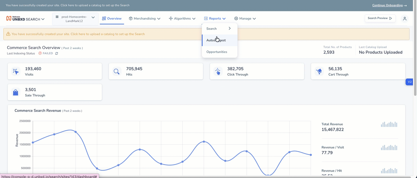
Log in to the Unbxd Search console and navigate to Reports > Autosuggest.
Access Autosuggest Reports
This report tracks engagement metrics for the following autosuggest suggestion types:
- Keyword Suggestions
- Top Search Queries
- Trending Queries
- Popular Products
- InField Suggestions
Report Views
The Autosuggest report is available in two views, switchable via tabs at the top of the page:
- Graph View: It visualizes autosuggest metrics over time as a trend or funnel chart.
- Table View: It displays a breakdown of autosuggest metrics by suggestion type in a tabular format.
Graph View
The Graph View visualizes autosuggest metrics over time. Use this view to spot trends, spikes, and drops in engagement across a selected date range.
Filters and Controls
At the top of the Graph View, you can configure the following options:
| Control | Description |
|---|---|
| Suggestion Type | Filter the chart by a specific suggestion type: All Suggestions, InField Suggestion, Keyword Suggestion, Top Search Queries, Trending Queries, or Popular Products. |
| Date Range | Select a preset range or define a custom date range. |
| Y-Axis Metrics | Choose two metrics to plot on the left and right Y-axes using the dropdowns (e.g., Hits vs CTR). |
| View Toggle | Switch between Trend (line chart over time) and Funnel (conversion funnel) visualizations. |
Summary Metric Cards
Below the filters, six summary cards display aggregate values for the selected date range and suggestion type:
| Metric | Description |
|---|---|
| Hits | Number of times shoppers selected a suggestion from autosuggest. |
| Clicks | Number of times shoppers clicked a product from the Product Listing Page (PLP) after selecting a query suggestion. For Popular Products, Hits and Clicks are the same. |
| Carts | Number of times a shopper added a product to their cart after selecting a query suggestion from autosuggest. |
| Orders | Number of products shoppers ordered after adding them to the cart via autosuggest. |
| Revenue | Total revenue generated from orders placed through autosuggest. |
| CTR | Click-through rate, the ratio of clicks to hits, expressed as a percentage. |
| Conversion | Conversion rate, the ratio of orders to hits, expressed as a percentage. |
Trend Chart
The Trend chart plots the two selected metrics over time as a dual-axis line chart. The left Y-axis represents one metric (e.g., Hits) and the right Y-axis represents the second metric (e.g., CTR). Dates are shown on the X-axis.
Reading the chart:
- Use the legend at the bottom to identify which line corresponds to which metric.
- Hover over data points to view exact values for a given date.
- Look for peaks and dips to identify high- and low-engagement days and investigate root causes.
Note:To download an Autosuggest Report in
.csvformat, click the download icon at the top-right of the screen.
Table View
The Table View provides a side-by-side breakdown of all autosuggest metrics, segmented by suggestion type. This is the best view for comparing performance across suggestion types at a glance.
Metrics
| Metric | Description |
|---|---|
| Type | The autosuggest suggestion category: Total (all types combined), Top Search Queries, Trending Queries, Keyword Suggestion, InField Suggestion, or Popular Products. |
| Hits | Number of times shoppers selected a suggestion from autosuggest. |
| Clicks | Number of times shoppers clicked a product on the PLP after selecting a query suggestion. For Popular Products, Hits and Clicks are the same. |
| Carts | Number of times a shopper added a product to their cart after selecting a query suggestion. |
| Orders | Number of products ordered by shoppers after adding them to the cart through autosuggest. |
| Sale Through | Number of items that moved from cart to a completed order. |
| Click Through | Number of product clicks that followed a query suggestion selection. |
| Conversion | Conversion Rate = Orders / Hits. The ratio of products ordered from auto-suggested queries. |
| CTR | Click-Through Rate = Clicks / Hits. Measures how often shoppers click through after selecting a suggestion. |
| Revenue | Total revenue generated from orders placed through each suggestion type. |
Key Insights
- Keyword Suggestion drives the overwhelming majority of hits (120,352 out of 133,724 total), clicks, carts, and revenue — making it the most impactful suggestion type.
- Trending Queries accounts for 13,371 hits with a 23.51% CTR, suggesting strong relevance when shoppers engage with them.
- Top Search Queries shows negligible activity (1 hit, 0 clicks) for this period, which may indicate a configuration or visibility issue that warrants investigation.
- The 0.47% conversion rate for Keyword Suggestions is higher than Trending Queries (0.06%), indicating Keyword Suggestions drives more completed purchases.
Suggestion Types
Keyword Suggestions
Keyword Suggestions are the foundational query suggestions that appear as a shopper begins typing a product name or search term. Suggestions surface based on the typed query or relevant synonyms. With the Keyword Suggestion report, you can view all queries that received hits, clicks, or orders for the selected time period.
Use this report to identify:
- Which keyword queries are driving the most engagement and conversions.
- Queries with high hits but low clicks — these may indicate relevance issues in the results shown.
- Queries with zero engagement — consider whether synonyms or boosting rules need to be updated.
Trending Queries
Trending Queries appear based on recent shopper behavior on the site — frequently searched queries and related synonyms are surfaced as suggestions. This suggestion type is dynamic and reflects current shopping trends.
Use this report to identify:
- Queries that are gaining popularity and driving high CTR.
- Emerging product trends that can inform merchandising decisions.
- Underperforming trending queries that may need synonym or ranking adjustments.
Top Search Queries
Top Search Queries are the most historically searched queries on the site, surfaced as suggestions to help shoppers quickly navigate to popular results. These are based on aggregate historical search frequency rather than real-time trends.
Use this report to monitor whether top queries are still relevant and converting. A drop in engagement may signal that historically popular queries are no longer aligned with current shopper intent.
InField Suggestions
InField Suggestions are sub-fields of an autosuggest query. They appear when products are organized under different categories or brands, displaying the query in the context of a specific category (e.g., "Shirts in Men's Clothing"). InField Suggestions help shoppers navigate directly into a relevant category from autosuggest.
Use this report to:
- Understand which category-level suggestions are driving engagement.
- Identify categories that appear as InField Suggestions but receive low clicks — this may indicate the suggestions are too narrow or the category needs better product coverage.
Popular Products
Popular Products shows a list of similar products that appear based on the query phrase typed by the shopper. This allows buyers to add items to their cart directly from the autosuggest dropdown with a single click.
For Popular Products, Hits and Clicks are treated as the same metric, since selecting a product from autosuggest is itself the click action.
Use this report to identify:
- Which products are being surfaced most often and driving direct cart additions.
- Products with high views but low cart adds — these may need better pricing, imagery, or descriptions.
- Least popular products that may need to be excluded from autosuggest suggestions.
You can re-order the Popular Products list by any available metric (e.g., sort by Orders to surface the highest-converting products first).