Javascript SDK
Unbxd Search JS SDK helps you integrate Unbxd search and its functionalities.
With SDK documentation, you can optimise your layout of search results by integrating custom search Javascript (JS).
You will generate a search page template and make corresponding changes to the JS-SDK configuration to render the appropriate HTML responses. The search text box event needs to be replaced with the Unbxd event.
Libraries
| Library | Version |
|---|---|
| jQuery | 1.11.3 or higher |
| Handlebars | 3.0.3 or higher |
If your website is not using the above mentioned libraries then the same can be bundled along with unbxd search js file. For more details, check config options in bundle build procedure.
Quickstart
Here, we will learn how to integrate the Unbxd Search JS SDK to optimize and power the search results display page on your site.The final integrated result that we are aiming at with this quickstart can be seen at this codesandbox.
The first step is to include the Unbxd Search JS along with its required dependencies.
For this add the following CSS & JS files into the “<Head>” section of your HTML page.
<head>

    <link rel="stylesheet" href="http://demo-unbxd.unbxdapi.com/static/demo-unbxd/stylesheets/search.css” />

   <script type="text/javascript" src="https://cdnjs.cloudflare.com/ajax/libs/jquery/1.11.3/jquery.min.js”></script>

   <script type="text/javascript"

src="https://cdnjs.cloudflare.com/ajax/libs/handlebars.js/3.0.3/handlebars.min.js”></script>

    <script type="text/javascript" src="https://libraries.unbxdapi.com/unbxdSearch_v2.js”></script>

</head>
Next, we instantiate the “setSearch” method available on the “Unbxd” window variable with the relevant configs. “setSearch” function accepts the search config object as an argument.
 <script type="text/javascript”>
     new Unbxd.setSearch({
       siteName: “<your site key>",
       APIKey: “<your API key>",
       type: "search",
       inputSelector: "#search_input"
     });
   </script>
Let us walk through the important configs that need to be passed along with their values for powering the search results page.
NOTEYou can find a detailed list of all acceptable configs list .
Authentication
Once installed, yo need to authenticate your Unbxd extension using your Unbxd account keys (also known as Authentication Keys).
Whenever a customer signs up with Unbxd, they are issued one or more site keys and api keys depending on their use case. Some common scenarios:
For a customer with one website and two environments (production and staging), 2 site keys (one for each environment) and 1 API key is issued
For a customer with more than one website (multi website vendor), the site key would be issued for every website + environment combination. So there would be an “n” number (equal to the number of website’s) of API keys generated.
For multiple site keys, check if you have:
- more than one environment
- more than one website
- different product set for staging and live, or
- wish to track search performance and clicks separately for every microsite.
To get your Site Key and API Key in the console, please refer to the steps mentioned in the Help Documentation.
Pass the Site Key and API Key that you get from the console in the “siteName” and “APIKey” configs.
siteName:
| Property | Details |
|---|---|
| Data type | string |
| Required | true |
| Default | NA |
| Description | Site name assigned by Unbxd (unique identifier for each customer/site) |
APIKey:
| Property | Details |
|---|---|
| Data type | string |
| Required | true |
| Default | NA |
| Description | Unique API key assigned by unbxd |
At the end of this step, you should have the Site Key & API Key which can be passed into the “siteName” & “APIKey” configs as shown below:
   new Unbxd.setSearch({
       siteName: "<your site key>",
       APIKey: "<your API key>"
     });
Types of Pages to render
This section allows you to indicate the product types available in your catalog while excluding specific categories of products while synchronizing.
The Unbxd extension supports seven types of products:
With Unbxd, you can configure the following product settings:
- Search: used to power search results pages
- Browse: powers category listing pages
- Recommendations: powers personalized recommendations for the shoppers
Pass a config parameter called “type” to indicate whether you want to render the search results page (type=”search”) or the category listing page (type=”category”)
type:
| Property | Details |
|---|---|
| Data type | string |
| Required | true |
| Default | search |
| Description | Used to indicate if the page is a search page or a category page. |
| Possible values: | |
| |
| |
| Dependency |
|
|
At the end of this step, you should choose a “type” of the page that you want to render and pass it in the config as shown below:
 new Unbxd.setSearch({
       siteName: “<your site key>",
       APIKey: “< your API key >",
    type: "search"
     });
Configuring the Page
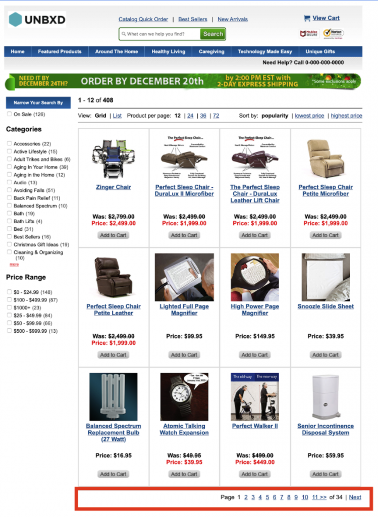
Before we delve into the next set of configs, let’s first understand the most common sections present in a search results page or category landing page.A search results page or a category landing page is made up of the following set of sections:
- Products list section
- View type could be grid or list view
- Sort by widget
- Pagination widget with no. of products per page control
- Pagination could be infinite scroll or page number based
- Facets section
- Spell check / search results message section
- Merchandising banners section
Here is a graphical representation of the various sections on a search results page:
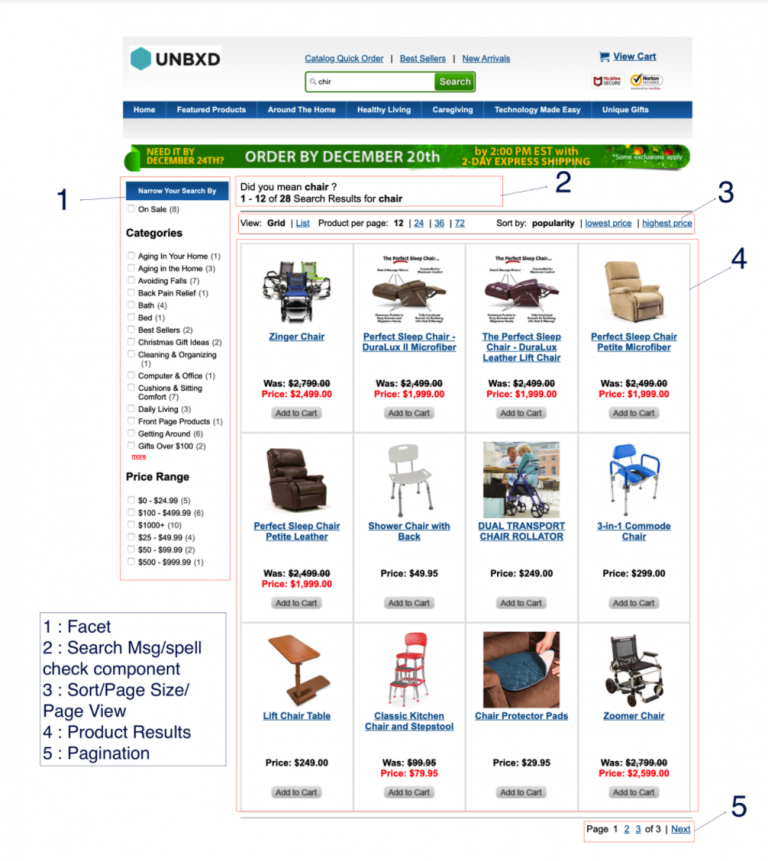
In the following sections , we will discuss how to configure and render each of these sections with the Unbxd Search JS SDK.
Search input box & search button selector
The following two parameters are used by the SDK to bind keyboard and mouse events to the search input field and search button on your website.
inputSelector:
| Property | Details |
|---|---|
| Data type | string |
| Required | false |
| Default | #search_query |
| Description | CSS selector of the search input box |
searchButtonSelector:
| Property | Details |
|---|---|
| Data type | string |
| Required | false |
| Default | #search_button |
| Description | Search query parameter name which contains the searched keyword |
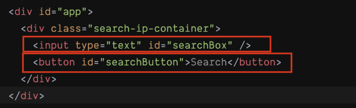
At the end of this step, you should have configured the “inputSelector” & “searchButtonSelector” as shown below:
new Unbxd.setSearch({
siteName: “<your site Key>",
APIKey: “<your API Key>",
type: "search",
inputSelector: "#searchBox",
searchButtonSelector: "#searchButton"
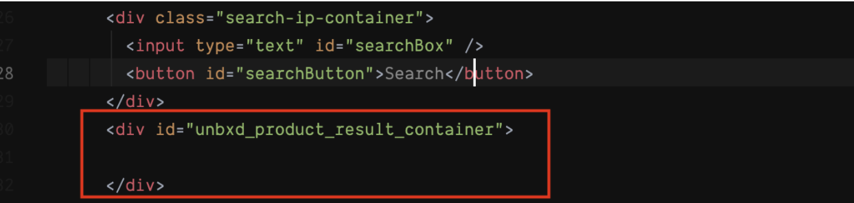
});Search product results containerTo render the products that resulted from the search API for the search term, you need to configure the CSS selector of the search results container. For this you can use the “searchResultContainer” config.
| Property | Details |
|---|---|
| Data type | string |
| Required | true |
| Default | NA |
| Description | CSS selector of the product results wrapper in your webpage |
| Sample Value | #unbxd_product_results_container |
In addition to the “searchResultContainer”, you can also configure the handlebars template to be used for each of the product cards using the “searchResultSetTemp” config.
searchResultSetTemp:
| Property | Details |
|---|---|
| Data type | array / function |
| Required | true |
| Default | – |
| Description | When configured as an array, a HTML scheme to display the product for each view type must be configured. Or a JavaScript function, where the data will be passed as an input argument and the function should handle the dynamic binding of the HTML section. |
| Input Value | Properties in the input object, numberOfProducts:number -> Total Count of products matching the search term or browse location Start:number -> starting position of the result in the array (this would change while paginating through pages) Products:array -> Product result data *input data -> {numberOfProducts: 5361 start: 0 products: [ { productUrl: “/shop/prod/mens-spring-step-casual-shoes/423424.htm” was_price_min: 69.95 title: “Mens Spring Step Casual Shoes” was_price_max: 69.95 uniqueId: “ZTZ47C” price_max: 69.95 brand: [“Spring Step”] price_min: 69.95 more_colors_available: “true” imageUrl: [“/images/store/product/images/563794479patrick.jpg”] variantTotal: 5 score: 0.4200723 relevantDocument: “parent” variantCount: 5 unbxdprank: 1 }] unbxdparam_requestId: null } Sample Value |
Properties in the input object,


numberOfProducts:number ->  Total Count of products matching the search term or browse location

Start:number ->  starting position of the result in the array (this would change while paginating through pages)

Products:array -> Product result data


*input data -> {numberOfProducts: 5361

start: 0

products: [

{

productUrl: “/shop/prod/mens-spring-step-casual-shoes/423424.htm”

was_price_min: 69.95

title: “Mens Spring Step  Casual Shoes”

was_price_max: 69.95

uniqueId: “ZTZ47C”

price_max: 69.95

brand: [“Spring Step”]

price_min: 69.95

more_colors_available: “true”

imageUrl: [“/images/store/product/images/563794479patrick.jpg”]

variantTotal: 5

score: 0.4200723

relevantDocument: “parent”

variantCount: 5

unbxdprank: 1

}]

unbxdparam_requestId: null

}

Sample Value

[ grid: [{{#products}}

<div class=”unbxd_product_tile”>

    <a href=”{{productUrl}}” class=”image-hover unbxd-product-image” title=”{{title}}” data-url=”{{productUrl}}”

        unbxdparam_title=”{{ItemName}}” unbxdattr=”product” unbxdparam_sku=”{{uniqueId}}”

        unbxdparam_prank=”{{unbxdprank}}”>

        <img alt=”{{title}}” src=”{{imageurl}}”>


    <div class=”prod_price assortment_price”>

        <div class=”clearfix subpend-1 price-display featured-pricing money” itemtype=”http://schema.org/Offer”

            itemscope=”” itemprop=”offers”>

            <span class=”bold”>Price: </span>

     <span class=”bold m-large” itemprop=”price”><span

                    class=”dollar”>$</span>{{price_min}}

                – ${{price_max}}</span>

        </div>

    </div>

    <div class=”suppend-1 prod_title”>

        {{title}}

    </div>

    <div class=”subpend-1 product-ratings”><img class=”sli_ratings_scaled ae-img”

            src/store/content/bazaarVoice/images/{{no_of_stars}}.gif”

            alt=”{{no_of_stars}} star rating”>

        ({{getReviewCount}}

        review)</div>

    <p class=”sli_grid_excerpt”>{{description}}</p>

     </a>

</div>

{{/products}}].join(‘’),

List: [{{#products}}

<div class=”unbxd_product_list_tile”>

    <div class=”unbxd_col1″>

        <a href=”{{#getRelativePath productUrl}}{{/getRelativePath}}”><img

                src=”{{#getRelativePath imageUrl}}{{/getRelativePath}}” alt=”{{ItemName}}” title=”{{ItemName}}”

                unbxdparam_title=”{{ItemName}}” unbxdattr=”product” unbxdparam_sku=”{{uniqueId}}”

                unbxdparam_prank=”{{unbxdprank}}”></a></div>

    <div class=”unbxd_col2″>

        <h2 class=”unbxd_product_title”><a href=”{{#getRelativePath productUrl}}{{/getRelativePath}}”

                title=”{{ItemName}}” unbxdparam_title=”{{ItemName}}” unbxdattr=”product” unbxdparam_sku=”{{uniqueId}}”

                unbxdparam_prank=”{{unbxdprank}}”>{{ItemName}}</a></h2>

        {{#if ShortDescription}}<div class=”unbxd_product_description”>{{#trim ShortDescription maxchar=400 }}

            {{/trim}}<span>…<a href=”{{#getRelativePath productUrl}}{{/getRelativePath}}”>More</a></span></div>{{/if}}

        <div class=”unbxd_product_price”>

            {{#ifValidPrice OriginalPrice CurrentPrice}}

            {{#isSalePriceOffered OriginalPrice CurrentPrice}}<div>Was: <span

                    class=”was_price”>${{#priceFormatter OriginalPrice}}{{/priceFormatter}}</span></div>

            <div class=”promo_price”>Price: ${{#priceFormatter CurrentPrice}}{{/priceFormatter}}</div>{{else}}

            <div class=”sell_price”>Price: ${{#priceFormatter CurrentPrice}}{{/priceFormatter}}</div>

            {{/isSalePriceOffered}}

            {{/ifValidPrice}}

            <div class=”unbxd-add-to-cart”>

                {{#ifValidPrice OriginalPrice CurrentPrice}}

                <form action=”/shop.axd/AddToCartBP”>

                    <input type=”hidden” name=”edp_no” value=”{{ProductId}}” /><input type=”hidden” name=”qty”

                        value=”1″ />

                    <input type=”image” class=”addToCart”

                        src=”{{#getRelativePath “https://www.firststreetonline.com/images/buttons/addToCart.png”}}{{/getRelativePath}}”

                        value=”Submit” alt=”{{ItemName}}” unbxd_variant_count=”{{variantCount}}”

                        unbxd_product=”{{ProductId}}” />

                </form>

                {{else}}

                <a href=”{{#getRelativePath productUrl}}{{/getRelativePath}}” unbxdparam_title=”{{ItemName}}”

                    unbxdattr=”product” unbxdparam_sku=”{{uniqueId}}” unbxdparam_prank=”{{unbxdprank}}”

                    class=”unbxd-clickable-text”><span>Click for More Info</span></a>

                {{/ifValidPrice}}


            </div>

        </div>

    </div>

    <div class=”clear”></div>

</div>

{{/products}}

].join(‘’)

]
Sort Options
Sorting allows you to rearrange the search results based on certain fields in a particular order.
To render the Sort By feature, you need to configure the CSS selector of the Sort By container in your webpage. For this you can use the “sortContainerSelector” config.
sortContainerSelector:
| Field | Value |
|---|---|
| Required | false |
| Default | NA |
| Description | CSS selector of the sort section in your webpage |
| Sample Value | #sort_section |
You can configure the list of sort by options to be displayed using the “sortOptions” config.
sortOptions:
| Field | Value |
|---|---|
| Data type | array |
| Required | false |
| Description | List of sort by options to be displayed on the web |
| Sample Value / Default Value | [ { name: 'Relevancy' }, { name: 'Price: H-L', field: 'price', order: 'desc' }, { name: 'Price: L-H', field: 'price', order: 'asc' } ] |
You can configure whether the sort by options should be shown as a dropdown or as individual clickable items using the “sortContainerType” config.
sortContainerType:
| Field | Value |
|---|---|
| Data type | string |
| Required | True (only if sort is applicable) |
| Default | select |
| Description | Used to indicate if the sort option is implemented as a select dropdown or individual clickable items |
| Accepted Values | click or select |
| click | When the sort is styled as an anchor or any other clickable element |
| select | When the sort section is styled using a <select> element |
You can further customize the HTML of the sort by options by providing a handlebars template in the “sortContainerTemp” config.
sortContainerTemp:
| Field | Value |
|---|---|
| Data type | string |
| Required | True (only if sort is applicable) |
| Default Value | '{{#options}}', '{{#if selected}}', '{{name}}', '{{else}}', '{{name}}', '{{/if}}', '{{/options}}' |
| Description | String representation of the HTML schema on how the sort section is to be rendered. |
| Input Value | An array of sort option objects is passed as input to the template. The currently selected sort option will have the selected property set to true. |
| Input Data Example | json { "options": [ { "name": "Popularity", "selected": true }, { "name": "Low to High Price", "field": "price_min", "friendlyUrlText": "price-low", "order": "asc", "selected": false }, { "name": "High to Low Price", "field": "price_max", "friendlyUrlText": "price-high", "order": "desc", "selected": false }, { "name": "Newest First", "field": "published_date", "friendlyUrlText": "newest", "order": "desc", "selected": false }, { "name": "Top Rated", "field": "no_of_stars", "friendlyUrlText": "ratings", "order": "desc", "selected": false } ] } |
| Sample Value | html Search results {{#if query}}for: {{query}} ({{start}} – {{end}} of {{numberOfProducts}} products){{/if}} Sort By: {{#options}} {{name}} {{/options}} |
Pagination
Pagination displays the right set of products with respect to the number of products shown on one page(rows parameter).
You can configure the different pagination sections in a certain way.
Traditional Based Pagination
This traditional type of pagination displays the set number of products on one page.
isPagination:
To implement a traditional page number based pagination, set the “isPagination” config to “true”.
| Field | Value |
|---|---|
| Data type | boolean |
| Required | false |
| Default | false |
| Description | Set it to true if you need traditional paginated links for previous and next pages |
| Default Value | false |
| Accepted Values | true or false |
setPagination:
The user can be redirected to another page after clicking a page link which is configured using ‘setPagination’. This is a callback function.
| Field | Value |
|---|---|
| Data type | function |
| Required | false |
| Default | NA |
| Description | Post-results processing hook to extend custom behavior. It is a function with three arguments: |
| |
| |
|
paginationContainerSelector:
To render the pagination section with the page links, you need to configure the CSS selector of the pagination container in your web page using “paginationContainerSelector”.
| Field | Value |
|---|---|
| Data type | string |
| Required | true (only if isPagination is true) |
| Default Value | NA |
| Description | CSS selector of the pagination section on your webpage |
| Sample Values | #pagination_section |
paginationTemp:
You can configure the handlebars template to be used for the pagination section using the “paginationTemp” config.
| Field | Value |
|---|---|
| Data type | string |
| Required | false |
| Description | String representing the HTML for pagination section on the page |
[
‘{{#if hasFirst}}’,
‘<span class=”unbxd_first” unbxdaction=”first”> « </span>’,
‘{{/if}}’,
‘{{#if hasPrev}}’,
‘<span class=”unbxd_prev” unbxdaction=”prev”> < </span>’,
‘{{/if}}’,
‘{{#pages}}’,
‘{{#if current}}’,
‘<span class=”unbxd_page highlight”> {{page}} </span>’,
‘{{else}}’,
‘<span class=”unbxd_page” unbxdaction=”{{page}}”> {{page}} </span>’,
‘{{/if}}’,
‘{{/pages}}’,
‘<span class=”unbxd_pageof”> of </span>’,
‘<span class=”unbxd_totalPages” unbxdaction=”{{totalPages}}”>{{totalPages}}</span>’,
‘{{#if hasNext}}’,
‘<span class=”unbxd_next” unbxdaction=”next”> > </span>’,
‘{{/if}}’,
‘{{#if hasLast}}’,
‘<span class=”unbxd_last” unbxdaction=”last”>»</span>’,
‘{{/if}}’
].join(”)The input data will have the following properties
*Input data ->
{
hasFirst: false //if current-2 page is available to navigate
hasPrev: false // if current – 1 page is available to navigate
pages: (2) [{page: 1, current:false},{page: 2, current:true},{page:3,current:false} {…}]
totalPages: 112
hasNext: true // if current + 1 page is available to navigate
hasLast: true // if current+2 page is available to navigate
productResultCount: 5361 // total number of products
}{{#if hasPrev}}
<a href=”javascript:;” class=”pagination-link unbxd_prev” unbxdaction=”prev”>Previous</a><span
class=”seperator”>|</span>
{{/if}}
<span class=”pagination-label”>Page</span>
{{#pages}}
{{#if current}}
<span class=”pagination-link”>{{page}}</span>
{{else}}
{{#unbxdIf page ../startPage}}
{{#if ../hasFirst}}
<a href=”javascript:;” class=”pagination-link” unbxdaction=”{{page}}”><< {{page}}</a>
{{else}}
<a href=”javascript:;” class=”pagination-link” unbxdaction=”{{page}}”>{{page}}</a>
{{/if}}
{{else}}
{{#unbxdIf page ../endPage}}
{{#if ../hasLast}}
<a href=”javascript:;” class=”pagination-link” unbxdaction=”{{page}}”>{{page}} >></a>
{{else}}
<a href=”javascript:;” class=”pagination-link” unbxdaction=”{{page}}”>{{page}}</a>
{{/if}}
{{else}}
<a href=”javascript:;” class=”pagination-link” unbxdaction=”{{page}}”>{{page}}</a>
{{/unbxdIf}}
{{/unbxdIf}}
{{/if}}
{{/pages}}
<span class=”pagination-label”> of {{totalPages}}</span>
{{#if hasNext}}
<span class=”seperator”>|</span><a href=”javascript:;” class=”pagination-link unbxd_next” unbxdaction=”next”>Next</a>
{{/if}}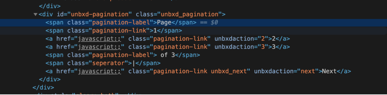
Infinite scroll based pagination
To implement an infinite scroll or auto scroll based pagination, set the “isAutoScroll” config to “true”
isAutoScroll:
| Field | Value |
|---|---|
| Data type | boolean |
| Required | false |
| Description | Set it to true if you want infinite scroll or autoscroll behavior for the pagination. |
| Default Value | false |
| Accepted Values | true or false |
| Note | When both isAutoScroll and isPagination configs are set to true, the isAutoScroll config takes precedence. |
You can configure the height at which to trigger API call to fetch the next page results using the “heightDiffToTriggerNextPage” config
heightDiffToTriggerNextPage:
| Field | Value |
|---|---|
| Data type | number |
| Required | True (when isAutoScroll is set to true) |
| Default Value | 100 |
| Description | Numeric representation in pixels from bottom of the page before which a call to fetch the next page results should kick in |
| Sample Values | 250 — When the scroll position is less than 250 px from the bottom of the page, the next set of results will be loaded |
Load More button pagination
If you want to show a “Load More” button to trigger pagination, set the “isClickNScroll” config to true.
isClickNScroll:
| Field | Value |
|---|---|
| Data type | boolean |
| Required | False |
| Default Value | false |
| Description | Set this to true if you want to simulate a “load more” results behavior instead of auto scroll or paginated links |
| Sample Values | true |
If “isClickNScroll” config is set to “true”, provide the “load more” button container selector using the “clickNScrollElementSelector” config.

clickNScrollElementSelector:
| Field | Value |
|---|---|
| Data type | string |
| Required | True (if isClickNScroll is true) |
| Default Value | #load-more |
| Description | CSS selector of the button or link that triggers the load more action |
| Sample Values | #load_more_results |
Facets
When synchronizing a catalog, the Last Synchronization information may display four status codes:
This section documents the different properties used to configure the different aspects of facets or filters section on your webpageTo render the facets on the search results page, you need to configure the CSS selector of the facets container in your webpage. For this you can use the “facetContainerSelector” config.
facetContainerSelector:
| Field | Value |
|---|---|
| Data type | string |
| Required | True |
| Default Value | NA |
| Description | CSS selector of the section containing the facets for the search results |
| Sample Values | #facets_container |
If you have checkboxes for the facet values, configure their CSS selector using the “facetCheckboxSelector” config.
facetTemp:
| Field | Value | |
|---|---|---|
| Data type | string | |
| Required | false | |
| Default Value | [‘{{#each filters}}’, ‘<ol>’, ‘<li>’, ‘<span class=”label”>{{@key}}:</span>’, ‘{{#each this}}’, ‘<div class=”refineSect”>{{@key}}<a href=”#” class=”btn-remove”></a>’, ‘</div>’, ‘{{/each}}’, ‘</li>’, ‘</ol>’, ‘{{/each}}’].join(”) | |
| Description | String representation of the HTML schema to display the facet section |
*input data ->

{ facets:[

{

         “name”:”Rating”,

         “facet_name”:”ratings_uFilter”,

         “type”:”facet_fields”,

         “selected”:[

{

               “value”:”1″,

               “count”:429,

               “isMultilevel”:false

            }

         ],

         “unselected”:[

            {

               “value”:”2″,

               “count”:395,

               “isMultilevel”:false

            },

            {

               “value”:”3″,

               “count”:1121,

               “isMultilevel”:false

            },

            {

               “value”:”4″,

               “count”:4389,

               “isMultilevel”:false

            },

            {

               “value”:”5″,

               “count”:4706,

               “isMultilevel”:false

            }

         ],

         “unordered”:[

            {

               “value”:”1″,

               “count”:429,

               “isSelected”:false,

               “isMultilevel”:false

            },

            {

               “value”:”2″,

               “count”:395,

               “isSelected”:false,

               “isMultilevel”:false

            },

            {

               “value”:”3″,

               “count”:1121,

               “isSelected”:false,

               “isMultilevel”:false

            },

            {

               “value”:”4″,

               “count”:4389,

               “isSelected”:false,

               “isMultilevel”:false

            },

            {

               “value”:”5″,

               “count”:4706,

               “isSelected”:false,

               “isMultilevel”:false

            }

         ],

         “isMultilevel”:false,

         “expandByDefault”:false,

         “searchEnabled”:false

         }],

    “rangefacets”:[

      {

         “name”:”Price Range”,

         “facet_name”:”was_price_max”,

         “type”:”facet_ranges”,

         “selected”:[


         ],

         “unselected”:[

            {

               “begin”:”0″,

               “end”:”200″,

               “count”:71316,

               “value”:”0 TO 200″

            },

            {

               “begin”:”200″,

               “end”:”400″,

               “count”:4577,

               “value”:”200 TO 400″

            },

            {

               “begin”:”400″,

               “end”:”600″,

               “count”:1586,

               “value”:”400 TO 600″

            },

            {

               “begin”:”600″,

               “end”:”800″,

               “count”:782,

               “value”:”600 TO 800″

            },

            {

               “begin”:”800″,

               “end”:”1000″,

               “count”:402,

               “value”:”800 TO 1000″

            }

         ],

         “unordered”:[

            {

               “begin”:”0″,

               “end”:”200″,

               “count”:71316,

               “value”:”0 TO 200″,

               “isSelected”:false

            },

            {

               “begin”:”200″,

               “end”:”400″,

               “count”:4577,

               “value”:”200 TO 400″,

               “isSelected”:false

            },

            {

               “begin”:”400″,

               “end”:”600″,

               “count”:1586,

               “value”:”400 TO 600″,

               “isSelected”:false

            },

            {

               “begin”:”600″,

               “end”:”800″,

               “count”:782,

               “value”:”600 TO 800″,

               “isSelected”:false

            },

            {

               “begin”:”800″,

               “end”:”1000″,

               “count”:402,

               “value”:”800 TO 1000″,

               “isSelected”:false

            }

         ],

         “isMultilevel”:false,

         “expandByDefault”:false

      }

      ]

}
<div class=”facet_heading” precompiled>Narrow Your Search By</div>
{{#facets}}
<div id=”{{facet_name}}”>
<h3 class=”facet_title”>{{name}}
{{#if selected.length}}
<a unbxdParam_facetName=”{{facet_name}}” unbxdParam_facetType=”{{type}}” href=”javascript:;”
class=”facet_reset”>Clear all</a>
{{/if}}
</h3>
<div class=”facet_values”>
{{#selected}}
<div class=”facet_value”>
<input type=”checkbox” id=”{{../facet_name}}-{{value}}” class=”selected” checked
unbxdParam_facetName=”{{../facet_name}}” unbxdParam_facetValue=”{{value}}” title=”{{value}}”
data-id=”{{../facet_name}}” data-value=”{{value}}” data-parent-label=”{../name}}” data-count=”{{count}}”
rel=”nofollow”>
<label for=”{{../facet_name}}-{{value}}” class=”selected”>{{#unbxdIf ../facet_name “v_PriceRange_uFilter”}}{{value}}{{else}}{{value}}{{/unbxdIf}}<span
class=”facet_result_count”>({{count}})</span></label>
</div>
{{/selected}}
{{#unselected}}
<div class=”facet_value” unbxdDisplay_Type=”{{displayType}}” {{#if ../viewall}}style=”display:flex”{{/if}}>
<input type=”checkbox” id=”{{../facet_name}}-{{value}}” unbxdParam_facetName=”{{../facet_name}}”
unbxdParam_facetValue=”{{value}}” title=”{{value}}” data-id=”{{../facet_name}}” data-value=”{{value}}”
data-parent-label=”{../name}}” data-count=”{{count}}” rel=”nofollow”>
<label for=”{{../facet_name}}-{{value}}”>{{#unbxdIf ../facet_name “v_PriceRange_uFilter”}}{{value}}{{else}}{{value}}{{/unbxdIf}}<span
class=”facet_result_count”>({{count}})</span></label>
</div>
{{/unselected}}
{{#if displayType}}
<a href=”javascript:;” class=”facet_more_link” unbxdParam_facetName=”{{facet_name}}” {{#if viewall}}style=”display:none”{{/if}}>more</a>
<a href=”javascript:;” class=”facet_less_link” unbxdParam_facetName=”{{facet_name}}” {{#if viewall}}style=”display:inline”{{/if}}>less</a>
{{/if}}
</div>
</div>
{{/facets}}
{{#rangefacets}}
<div id=”{{facet_name}}”>
<h3 class=”facet_title”>{{name}}
{{#if selected.length}}
<a unbxdParam_facetName=”{{facet_name}}” unbxdParam_facetType=”{{type}}” href=”javascript:;”
class=”facet_reset”>Clear all</a>
{{/if}}
</h3>
<div class=”facet_values”>
{{#selected}}
<div class=”facet_value”>
<input type=”checkbox” id=”{{../facet_name}}-{{value}}” class=”selected” checked
unbxdParam_facetName=”{{../facet_name}}” unbxdParam_facetValue=”{{value}}” title=”{{value}}”
data-id=”{{../facet_name}}” data-value=”{{value}}” data-parent-label=”{../name}}” data-count=”{{count}}”
rel=”nofollow”>
<label for=”{{../facet_name}}-{{value}}” class=”selected”>{{value}}<span
class=”facet_result_count”>({{count}})</span></label>
</div>
{{/selected}}
{{#unselected}}
<div class=”facet_value” unbxdDisplay_Type=”{{displayType}}” {{#if ../viewall}}style=”display:flex”{{/if}}>
<input type=”checkbox” id=”{{../facet_name}}-{{value}}” unbxdParam_facetName=”{{../facet_name}}”
unbxdParam_facetValue=”{{value}}” title=”{{value}}” data-id=”{{../facet_name}}” data-value=”{{value}}”
data-parent-label=”{../name}}” data-count=”{{count}}” rel=”nofollow”>
<label for=”{{../facet_name}}-{{value}}”>{{value}}<span
class=”facet_result_count”>({{count}})</span></label>
</div>
{{/unselected}}
{{#if displayType}}
<a href=”javascript:;” class=”facet_more_link” unbxdParam_facetName=”{{facet_name}}” {{#if viewall}}style=”display:none”{{/if}}>more</a>
<a href=”javascript:;” class=”facet_less_link” unbxdParam_facetName=”{{facet_name}}” {{#if viewall}}style=”display:inline”{{/if}}>less</a>
{{/if}}
</div>
</div>
{{/rangefacets}}
facetCheckboxSelector:
| Field | Value |
|---|---|
| Data type | string |
| Required | True |
| Default Value | NA |
| Description | CSS selector that applies to all checkbox input elements used to filter the facet values |
| Sample Values | #facets_container .facet_value input[type=checkbox] |
facetMultiSelect:
| Field | Value |
|---|---|
| Data type | boolean |
| Required | True |
| Default Value | true |
| Description | Set to true if you have faceted attributes (e.g., brand, color) which can be multi-selected. Example: customers can filter products by multiple colors at the same time (e.g., green, red, or blue). Set to false to restrict selection to only one facet value at a time. |
| Sample Values | true |
You can configure the handlebars template to be used for displaying the selected facets using the “selectedFacetTemp” config.
selectedFacetTemp:
| Field | Value |
|---|---|
| Data type | string |
| Required | false |
| Default Value | ['{{#each filters}}', '<ol>', '<li>', '<span class="label">{{@key}}:</span>', '{{#each this}}', '<div class="refineSect">{{@key}}<a href="#" class="btn-remove"></a>', '</div>', '{{/each}}', '</li>', '</ol>', '{{/each}}'].join("") |
| Description | String representation of the HTML schema to display the applied filters |
| Input Value | *input data -> { filters: [ {fcode: “Collection”, value: “Sherpa”, fsysname: “collection_uFilter”} ], ranges:[] } |
<ol class=”unbxd_selected_facets”>

    <li class=”sli_facet_list_ele”>Your Selections:</li>

    {{#filters}}

    <li class=”sli_facet_list_ele”>

        {{value}}<a href=”#”><img src=”/images/icons/x.jpg” alt=”Close” role=”button” tabindex=”0″

            data-ae-blurbtype=”button” class=”ae-img unbxd-remove-item” unbxdParam_facetName=”{{fsysname}}” unbxdParam_facetValue=”{{value}}”></a></li>

    {{/filters}}

</ol>
You need to configure the CSS selector of the container where the selected facets can be displayed using the “selectedFacetContainerSelector” config.
selectedFacetContainerSelector:
| Field | Value |
|---|---|
| Data type | string |
| Required | True |
| Default Value | NA |
| Description | CSS selector of the selected facet section on the page |
| Sample Values | #selected_filters_section |
If you have multilevel facets use the below two configs to indicate to the SDK to render the multilevel facet along with its name
facetMultilevel:
| Field | Value |
|---|---|
| Data type | boolean |
| Required | false |
| Default Value | false |
| Description | Set to true for multilevel facets |
| Sample Values | true |
facetMultilevelName:
| Field | Value |
|---|---|
| Data type | string |
| Required | True (if facetMultilevel is set to true) |
| Default Value | NA |
| Description | The field name of the multilevel facet field |
| Sample Values | CATEGORY |
You can configure the CSS selector of the “clear all facets” link using the “clearSelectedFacetsSelector” config.
clearSelectedFacetsSelector:
| Field | Value |
|---|---|
| Data type | string |
| Required | true |
| Default Value | NA |
| Description | CSS selector of the "Clear All" link to remove all applied filters on the page |
| Sample Values | #clear_all_filters |
You can configure the CSS selector for the individual selected facet clear button using the “removeSelectedfacetSelector” config.
removeSelectedfacetSelector:
| Field | Value |
|---|---|
| Data type | string |
| Required | true |
| Default Value | NA |
| Description | CSS selector of the individual reset filter links in the selected facet section |
| Sample Values | #remove_facet_btn |
Page Size
This section documents the different configs available to enable you to configure the number of products shown in a page.You can configure the number of products to be shown per page using the “pageSize” config
pageSize:
| Field | Value |
|---|---|
| Data type | number |
| Required | True (only when select page size section is available on the web) |
| Default Value | 12 |
| Description | Configure the number of products to be shown on a page |
| Sample Values | 24 |
If you want to show page size on your webpage, you must also provide the CSS selector for the container element using the “pageSizeContainerSelector” config
pageSizeContainerSelector:
| Field | Value |
|---|---|
| Data type | string |
| Required | True (when page size section is enabled) |
| Default Value | NA |
| Description | CSS selector of the page size container element on the page |
| Sample Values | #results_pagesize |
You can configure the page size options to be shown using the “pageSizeOptions” config.pageSizeOptions:
| Field | Value |
|---|---|
| Data type | array |
| Required | True (when page size section is enabled) |
| Description | The list of page size options to be shown Note: Unbxd has a maximum limit of 99 products per api call. |
[{

            name: ’12’,

            value: ’12’

        }, {

            name: ’24’,

            value: ’24’

        }]
[
{
name: ’48 item’,
value: ’48’
}, {
name: ’72 items’,
value: ’72’
}, {
name: ’96 items’,
value: ’96’
}
]Configure whether you want the page size options to show up as a list in a dropdown or as individual clickable items using the “pageSizeContainerType” config.pageSizeContainerType:
| Field | Value |
|---|---|
| Data type | string |
| Required | True (when page size section is enabled) |
| Default Value | select |
| Description | Indicates if the page size selection is done via click or a dropdown (select) |
| Accepted Values | click or select |
| click | When the page size section is styled as an anchor or any other clickable element |
| select | When the page size section is styled using a <select> element |
You can further customize the page size render behaviour by providing a handlebars template for the same using the “pageSizeContainerTemp” config
pageSizeContainerTemp:
| Field | Value |
|---|---|
| Data type | string |
| Required | True (when page size section is enabled) |
[

            ‘<select>’,

            ‘{{#options}}’,

            ‘{{#if selected}}’,

            ‘<option value=”{{value}}” selected unbxdpageSize=”{{value}}”>{{name}}</option>’,

            ‘{{else}}’,

            ‘<option value=”{{value}}” unbxdpageSize=”{{value}}”>{{name}}</option>’,

            ‘{{/if}}’,

            ‘{{/options}}’,

            ‘</select>’

        ].join(”)
String representation of the HTML schema on how the page size section to be rendered
*inputdata ->
{
options: [{name: “48 item”, value: “48”, selected: true}
{name: “72 items”, value: “72”, selected: false}
{name: “96 items”, value: “96”, selected: false}
]
}<span class=”ae-label” id=”unbxd-pageview-labelledby”>Show: </span>
<select aria-labelledby=”unbxd-pageview-labelledby” data-ae-blurbtype=”select”
data-ae-form-field=”true”>
{{#options}}
<option {{#if selected}}selected=”selected” {{/if}} unbxdpagesize=”{{value}}”>
{{name}}</option>
{{/options}}
</select>Page View
This section documents the different configs that can be used to configure the different views for displaying the products.
If you want to show an option to toggle the product list view type, you can provide the CSS selector for the container element using the “viewTypeContainerSelector” config & the SDK will render it for you.
viewTypeContainerSelector:
| Field | Value |
|---|---|
| Data type | string |
| Required | True (if more than one page view is enabled) |
| Default Value | NA |
| Description | CSS selector of the page view section on your webpage |
| Sample Values | #results-pageview |
You can configure the different view types to be shown using the “viewTypes” configviewTypes:
| Field | Value |
|---|---|
| Data type | array |
| Required | True (if viewTypeContainerSelector is provided) |
| Default Value | NA |
| Description | Indicates all different views available on the page |
| Sample Values |
|
You can further customize the render behaviour of the view type section by providing a handlebars template for the same using the “viewTypeContainerTemp” configviewTypeContainerTemp:
| Field | Value |
|---|---|
| Data type | string |
| Required | True (only when there is an option to switch between views on the website) |
[

            ‘{{#options}}’,

            ‘

‘,
            ‘‘,

            ‘‘,

            ‘{{value}}’,

            ‘‘,

            ”,

            ”,

            ‘{{/options}}’

        ].join(”),
String representation of the HTML schema on how the page view  section to be rendered


*inputdata ->


{

 options: [{name: “Grid”, value: “grid”, selected: true}

 {name: “List”, value: “list”, selected: false}

  ]

 }
View:
{{#options}}
{{value}}
{{/options}}To view the description of the labels in the screenshot above, refer to the table below.
| Label | Description |
|---|---|
| ID | Indicates the unique identifier of the record |
| Store View | Indicates the store related to upload operation |
| Created | Indicates the calendar date and time the specific upload queue entry was created |
| Finished | Indicates the upload end time of the catalog |
| Execution Time(s) | Indicates the duration of time (in seconds) the upload took to complete |
| Affected Entities | Indicates the total number of products affected by the feed upload |
| Number of Entities | Indicates the total number of entities in the upload process |
| Operation Type | Indicates the status of a feed upload operation: |
| |
| |
| |
| Additional Information | Indicates the information related to reindexing |
| Action | Indicates the action available for the specific entity: |
| |
| |
| Clear Feed View | Allows you to clear the Feed View queue |
| View Log | Allows viewing, downloading, refreshing, and clearing log file entries for the entire cron job |
| Actions | Allows deletion of feed upload for multiple entities |
| Filters | Allows creating filters to refine the Feed View table |
| Default View | Allows resetting the Feed View table to its original settings |
| Columns | Allows selecting which columns to display in the Feed View table |
| Log Viewer | Provides operations with the log file:
|
Spellcheck
This section documents the different configs that can be used to configure the different views for displaying the products
In such cases, the context-aware algorithm of Unbxd understands your visitor’s intent and sends a “Did You Mean” response along with a search result set for the query, if any.
This section documents the different properties to be configured to show “Did you mean?” spell check section on your webpage
For this, provide the CSS selector for the container element using the “spellCheck” config.
spellCheck:
| Field | Value |
|---|---|
| Data type | String |
| Required | false |
| Default Value | NA |
| Description | CSS selector to identify the "did you mention" section on the page |
| Sample Values | #did_you_mean |
You can further customize the spell check render behaviour by providing a handlebars template for the same using the “spellCheckTemp” configspellCheckTemp:
| Field | Value |
|---|---|
| Data type | String |
| Required | True |
| Default Value | '<h3>Did you mean : {{suggestion}}</h3>' |
| Description | String representing the HTML schema for the "did you mean" section using Handlebars template syntax |
| Input Data | { suggestion: "shoes", numberOfProducts: 0 } |
| Sample Values | <span class="base" data-ui-id="page-title-wrapper">Did you mean <span class="bold">{{suggestion}}</span> ?</span> |
Search Query Display
Displays the ‘query name’ while searching for the relevant products.
This section documents the different configs that can be used to show the searched query on your webpage
For this, provide the CSS selector for the container element using the “searchQueryDisplay” config
searchQueryDisplay:
| Field | Value |
|---|---|
| Data type | String |
| Required | True |
| Default Value | NA |
| Description | CSS selector to identify the search results message section on the page |
| Sample Values | #search_result_display |
You can further customize the search query message render behaviour by providing a handlebars template for the same using the “searchQueryDisplayTemp” configsearchQueryDisplayTemp:
| Field | Value |
|---|---|
| Data type | String |
| Required | True |
| Default Value | <h3>Search results for {{query}} – {{numberOfProducts}}</h3> |
| Description | String representing the HTML schema for the search message section using Handlebars template syntax |
| Sample Input | { numberOfProducts: 79816, start: 1, end: 48, query: "*" } |
| Sample Value | <span class="base" data-ui-id="page-title-wrapper">Did you mean <span class="bold">{{suggestion}}</span> ?</span> |
Variants
Configure variants display by using the configs in this section.To display variants pass the config “variants” as true
variants:
| Field | Value |
|---|---|
| Data type | Boolean |
| Required | False |
| Default Value | false |
| Description | Pass true to display variants |
| Sample Values | true |
Configure the number of variants to be shown using the “variantsCount” config.
variantsCount:
| Field | Value |
|---|---|
| Data type | Number |
| Required | False |
| Default Value | 1 |
| Description | Pass the number of variants to be shown for a product |
| Sample Values | 3 |
Swatches
Configure swatches display by using the configs in this section.To display swatches pass the config “isSwatches” as true
isSwatches:
| Field | Value |
|---|---|
| Data type | Boolean |
| Required | False |
| Default Value | false |
| Description | Pass true to display swatches |
| Sample Values | true |
Provide the selector to use for the swatches using “swatchesSelector” config
swatchesSelector:
| Field | Value |
|---|---|
| Data type | string |
| Required | False |
| Default Value | NA |
| Description | CSS selector of the swatches element |
| Sample Values | .swatch-box |
NOTEIf you wants swatches, variants count should be higher, and “groupBy” field should be present in mapped fields config as shown below:
Mapped Fields
You can pass on any custom field names for the important product attributes using the mapped fields config:
mappedFields:
| Field | Value |
|---|---|
| Data type | object |
| Required | Optional |
| Description | Pass the field names for the important product attributes that you want to render |
{

“imageUrl”: “imageUrl”,

“productUrl”: “productUrl”,

“title”: “title”,

“description”: “description”,

“price”: “price”,

“categoryPath”: “categoryPath”,

“variantFields”: {

“imageUrl”: “v_imageUrl”,

“productUrl”: “v_productUrl”,

“title”: “v_title”,

“price”: “v_price”,

“groupBy”: “variant_color”,

“swatchFields”: {

“swatch_background_image”: “variant_overhead_swatch”,

“swatch_background_color”: “variant_color”,

“swatch_click_image”: “variant_image_array”

}

}

}
Callback Functions
This section documents the different callback functions exposed by the SDK that you can provide to listen to various events
onFacetLoad:
| Field | Value |
|---|---|
| Data type | function |
| Required | Optional |
| Description | Callback function invoked after facets are rendered on the page. Can be used to scroll to top, bind events, etc. |
| Function accepts one argument: an object carrying information about the facets displayed. |
function (obj) {

                if (this.facetScrollTop) {

                    jQuery(“html, body”).animate({

                        scrollTop: 0

                    }, 300);

                    this.facetScrollTop = false;

                }

}
onIntialResultLoad:
| Field | Value |
|---|---|
| Data type | function |
| Required | Optional |
| Description | Callback function invoked when the Unbxd page binding happens for the first time. |
| Function receives one argument: an object containing the entire result set, including products and facets. | |
| Can be used to trigger analytics events, adjust product container height, etc. |
function (obj) {

var pids_list = [];

                for (var i = 0; i < obj[‘response’][‘products’].length; i++) {

                    var prd = obj[‘response’][‘products’][i];

                    var sku = prd[‘uniqueId’]

                    pids_list.push(sku.replace(/\./g, “”));

                }

                var impressionObj = { query: obj[‘searchMetaData’][‘queryParams’][‘q’], pids_list: pids_list };


                Unbxd.track(impressionObj, ‘search_impression’);


}
onPageLoad:
| Field | Value |
|---|---|
| Data type | function |
| Required | Optional |
| Description | Callback function invoked every time the page content is refreshed after the initial load (e.g., sorting, changing page size, paginating). |
| The function receives one argument: an object containing the entire result set including products and facets. | |
| Can be used to trigger analytics events, adjust product container height, etc. |
function (obj) {

var pids_list = [];

                for (var i = 0; i < obj[‘response’][‘products’].length; i++) {

                    var prd = obj[‘response’][‘products’][i];

                    var sku = prd[‘uniqueId’]

                    pids_list.push(sku.replace(/\./g, “”));

                }

                var impressionObj = { query: obj[‘searchMetaData’][‘queryParams’][‘q’], pids_list: pids_list };


                Unbxd.track(impressionObj, ‘search_impression’);


}
Unbxd Handlebar Helper Functions
unbxdIf
| Field | Value |
|---|---|
| Purpose | Use the unbxdIf function to conditionally render a block when two arguments are exactly equal. |
| Arguments | Accepts two arguments and evaluates to true if they are physically equal. |
| Usage | **The following example Renders “price” text when the value of facet_name property is equal to “v_PriceRange_uFilter”, else it would render the value of facet_name. {{#unbxdIf ../facet_name “v_PriceRange_uFilter”}} Price{{else}}{{../facet_name}}{{/unbxdIf}}**: |
prepareFacetValue
| Field | Value |
|---|---|
| Purpose | The prepareFacetValue function returns three non-breaking spaces if the argument value is empty. |
| Arguments | Accepts one argument and returns three non-breaking spaces if the argument is empty; otherwise returns the argument itself. |
| Usage | {{#prepareFacetValue value}}{{/prepareFacetValue}} |
List of available Configurations
The following table summarises the various properties which can be passed as search options while invoking the “setSearch” function in “Unbxd” object.
{{#products}}

<div class=”unbxd_product_tile”>

    <a href=”{{productUrl}}” class=”image-hover unbxd-product-image” title=”{{title}}” data-url=”{{productUrl}}”

        unbxdparam_title=”{{ItemName}}” unbxdattr=”product” unbxdparam_sku=”{{uniqueId}}”

        unbxdparam_prank=”{{unbxdprank}}”>

        <img alt=”{{title}}” src=”{{imageurl}}”>


    <div class=”prod_price assortment_price”>

        <div class=”clearfix subpend-1 price-display featured-pricing money” itemtype=”http://schema.org/Offer”

            itemscope=”” itemprop=”offers”>

            <span class=”bold”>Price: </span>

            <span class=”bold m-large” itemprop=”price”><span

                    class=”dollar”>$</span>{{price_min}}

                – ${{price_max}}</span>

        </div>

    </div>

    <div class=”suppend-1 prod_title”>

        {{title}}

    </div>

    <div class=”subpend-1 product-ratings”><img class=”sli_ratings_scaled ae-img”

            src/store/content/bazaarVoice/images/{{no_of_stars}}.gif”

            alt=”{{no_of_stars}} star rating”>

        ({{getReviewCount}}

        review)</div>

    <p class=”sli_grid_excerpt”>{{description}}</p>

     </a>

</div>

{{/products}}| Config Name | Data Type | Description | Sample Values / Notes |
|---|---|---|---|
| isAutoScroll | boolean | Set to true if you want autoscroll behavior and no pagination on the site | True When set to true,heightDiffToTriggerNextPage value is mandatory |
| heightDiffToTriggerNextPage | number | Numeric pixels from bottom of page before next page results load | 250 When scroll position is less than 250 px from bottom, next results load |
| isClickNScroll | boolean | Set true to simulate “load more” results instead of autoscroll or paginated links | true |
| clickNScrollElementSelector | string | CSS selector for the button or link triggering the load more action | #load-more-results |
| isPagination | boolean | Set true to enable traditional paginated links for previous and next pages | True If both autoscroll and pagination are true, autoscroll takes precedence |
| setPagination | function | Post results processing hook; function with 3 arguments: total pages (int), page size (int), current page (int) | Arguments to the function 1.Integer (total number of pages)
|
| paginationContainerSelector | string | CSS selector for the pagination section on the page | .page-nav-section |
| paginationTemp | string | String representing the htm scheme for pagination section on the page *Input data -> { hasFirst: false hasPrev: false pages: (2) [{…}, {…}] totalPages: 112 hasNext: true hasLast: true productResultCount: 5361 } |
{{#if hasPrev}}
<a href=”javascript:;” class=”pagination-link unbxd_prev” unbxdaction=”prev”>Previous</a><span
class=”seperator”>|</span>
{{/if}}
<span class=”pagination-label”>Page</span>
{{#pages}}
{{#if current}}
<span class=”pagination-link”>{{page}}</span>
{{else}}
{{#unbxdIf page ../startPage}}
{{#if ../hasFirst}}
<a href=”javascript:;” class=”pagination-link” unbxdaction=”{{page}}”><< {{page}}</a>
{{else}}
<a href=”javascript:;” class=”pagination-link” unbxdaction=”{{page}}”>{{page}}</a>
{{/if}}
{{else}}
{{#unbxdIf page ../endPage}}
{{#if ../hasLast}}
<a href=”javascript:;” class=”pagination-link” unbxdaction=”{{page}}”>{{page}} >></a>
{{else}}
<a href=”javascript:;” class=”pagination-link” unbxdaction=”{{page}}”>{{page}}</a>
{{/if}}
{{else}}
<a href=”javascript:;” class=”pagination-link” unbxdaction=”{{page}}”>{{page}}</a>
{{/unbxdIf}}
{{/unbxdIf}}
{{/if}}
{{/pages}}
<span class=”pagination-label”> of {{totalPages}}</span>
{{#if hasNext}}
<span class=”seperator”>|</span><a href=”javascript:;” class=”pagination-link unbxd_next” unbxdaction=”next”>Next</a>
{{/if}}| Config Name | Data Type | Description | Sample Values |
|---|---|---|---|
| facetMultiSelect | boolean | Set to true if facets can be multi-selected | true |
| facetContainerSelector | string | CSS selector matching the section containing the facets | #facets_container |
| facetCheckBoxSelector | string | CSS selector applying to all checkbox input elements for facets | #facets_container .facet_value input[type=checkbox] |
| selectedFacetContainerSelector | string | CSS selector matching the selected facet section on the page | #applied-filter-section |
| facetMultilevel | boolean | Set to true for multilevel facets | true |
| facetMultilevelName | string | Field name of the multi-level facet field | CATEGORY |
| clearSelectedFacetsSelector | string | CSS selector matching clear all link to remove all applied filters | #clear-all-filters |
| removeSelectedFacetSelector | string | CSS selector matching individual reset filter links in selected facet section | .unbxd-remove-item |
| loaderSelector | string | CSS selector for loader gif/image to indicate async loading | #loader-icon |
| selectedFacetTemp | string | String representation of the html schema to display the applied filters *input data -> { filters: [ {fcode: “Collection”, value: “Sherpa”, fsysname: “collection_uFilter”} ], ranges:[] } | |
| onFacetLoad | function | call back function which would be invoked after painting of facets on the page. This function can be used to scroll the page to top on completion of loading, bind additional event handlers if custom accordion implementation is required Function with one argument of type object which carriers information about the facets displayed. | |
<ol class=”unbxd_selected_facets”>

    <li class=”sli_facet_list_ele”>Your Selections:</li>

    {{#filters}}

    <li class=”sli_facet_list_ele”>

        {{value}}<a href=”#”><img src=”/images/icons/x.jpg” alt=”Close” role=”button” tabindex=”0″

            data-ae-blurbtype=”button” class=”ae-img unbxd-remove-item” unbxdParam_facetName=”{{fsysname}}” unbxdParam_facetValue=”{{value}}”></a></li>

    {{/filters}}

</ol>| Config Name | Type | Description | Code / Value |
|---|---|---|---|
| onIntialResultLoad | function | Callback function invoked when the unbxd page binding happens for the first time. Takes one argument (object) carrying entire result set including products and facets. Can be used to trigger analytics event, adjust product container height etc. | function (obj) { var pids_list = []; for (var i = 0; i < obj[‘response’][‘products’].length; i++) { var prd = obj[‘response’][‘products’][i]; var sku = prd[‘uniqueId’] pids_list.push(sku.replace(/\./g, “”)); } var impressionObj = { query: obj[‘searchMetaData’][‘queryParams’][‘q’], pids_list: pids_list }; Unbxd.track(impressionObj, ‘search_impression’); } |
| onPageLoad | function | Callback function invoked every time the page content refreshes after initial load (e.g. applying sort, changing page size, paginating). Takes one argument (object) carrying entire result set including products and facets. | function (obj) { var pids_list = []; for (var i = 0; i < obj[‘response’][‘products’].length; i++) { var prd = obj[‘response’][‘products’][i]; var sku = prd[‘uniqueId’] pids_list.push(sku.replace(/\./g, “”)); } var impressionObj = { query: obj[‘searchMetaData’][‘queryParams’][‘q’], pids_list: pids_list }; Unbxd.track(impressionObj, ‘search_impression’); } |
| sanitizeQueryString | function | Callback function used to sanitize the search query to handle special cases per customer requirement. Takes one argument (string) holding the searched query term. | function (q) { return q.trim();; } |
| getFacetStats | string | Variable name in the stats object which holds min and max values for range facet. | "facetstats" |
| processFacetStats | function | Function used to leverage max and min values of range facets to implement slider behaviour. Takes one argument (object) holding all facet information. | function (obj) { // any logic within } |
| setDefaultFilters | function | Invoked on every data fetch call from unbxd search engine. Used to apply default filters like showing only in-stock products. | function () { this.addFilter(“stock_availability”,”In Stock”); } |
| fields | array | List of product attribute names to fetch for matching products. Only include fields to save bandwidth. | ['title', 'unbxd_title', 'price', 'image_url', 'productUrl', 'doctype', 'saleprice', 'desktop_url', 'mobile_url', 'average_rating', 'min_price', 'max_price', 'price', 'sash_css_class', 'v_image_url', 'brand'] |
| onNoResult | function | Invoked when there are no matching products for the searched term. Takes one argument (object) holding result set including search term. | function(obj){ this.compiledNoResultsTemp = Handlebars.compile(this.options.onNoResultTemp); jQuery(“#no-results-section”).html(this.compiledNoResultsTemp({ query: obj.searchMetaData.queryParams.q })); } |
| noEncoding | boolean | Set to true to enable encoding of URL params and subsequent decoding. | true/false (value depends on configuration) |
| customReset | function | Called when sorting results, changing view, or resetting all filters. No arguments. | function (){ } |
| bannerSelector | string | CSS selector matching the merchandising banner slot on the page. | #up-sell-banner-section |
| bannerTemp | string | HTML template string used to apply promotional banner on the page. Input data: {landingUrl:"", imageUrl:""} | <a href='{{{landingUrl}}}'><img src='{{imageUrl}}'/></a> |
| bannerCount | number | Number of banners to be displayed on the page. | 2 |
| sortContainerSelector | string | CSS selector matching the sort section on the page. | #sort-section |
| sortOptions | array | Configurable sort options displayed on the page. | [ { name: 'Popularity' }, { name: 'Low to High Price', field: 'price_min', order: 'asc' }, { name: 'High to Low Price', field: 'price_max', order: 'desc' } ] |
| sortContainerType | string | Indicates if selecting sort option is by click or selecting from dropdown. | click or select |
| sortContainerTemp | string | HTML schema string for rendering the sort section. Input data example: | json { options: [ {name: "Popularity", selected: true}, {name: "Low to High Price", field: "price_min", friendlyUrlText: "price-low", order: "asc", selected: false}, {name: "High to Low Price", field: "price_max", friendlyUrlText: "price-high", order: "desc", selected: false}, {name: "Newest First", field: "published_date", friendlyUrlText: "newest", order: "desc", selected: false}, {name: "Top Rated", field: "no_of_stars", friendlyUrlText: "ratings", order: "desc", selected: false} ] } HTML snippet: html <span class="base" data-ui-id="page-title-wrapper">Search results {{#isNotEmptySearch query}}for: {{query}} <span class="product-count-holder">({{start}} – {{end}} of {{numberOfProducts}} products)</span>{{/isNotEmptySearch}}</span> <span class="ae-label" id="unbxd-sort-labelledby">Sort By: </span> <select aria-labelledby="unbxd-sort-labelledby" data-ae-blurbtype="select" data-ae-form-field="true"> {{#options}} <option {{#if selected}}selected="selected"{{/if}} unbxdsortField="{{field}}" unbxdsortValue="{{order}}"> {{name}} </option> {{/options}} </select> |
| pageSize | number | Number of products shown per page | 24 |
| pageSizeContainerSelector | string | CSS selector for the page size section | #results-pagesize |
| pageSizeOptions | array | List of available page size options (max 99 items per API call) | json [ {name: "48 item", value: "48"}, {name: "72 items", value: "72"}, {name: "96 items", value: "96"} ] |
| pageSizeContainerType | string | How page size option is selected: click or select | click or select |
| pageSizeContainerTemp | string | HTML schema string for rendering the page size section. Input example: | json { options: [ {name: "48 item", value: "48", selected: true}, {name: "72 items", value: "72", selected: false}, {name: "96 items", value: "96", selected: false} ] } HTML snippet: html <span class="ae-label" id="unbxd-pageview-labelledby">Show: </span> <select aria-labelledby="unbxd-pageview-labelledby" data-ae-blurbtype="select" data-ae-form-field="true"> {{#options}} <option {{#if selected}}selected="selected"{{/if}} unbxdpagesize="{{value}}"> {{name}} </option> {{/options}} </select> |
| viewTypeContainerTemp | string | HTML schema string for rendering page view section. Input example: | json { options: [ {name: "Grid", value: "grid", selected: true}, {name: "List", value: "list", selected: false} ] } HTML snippet: html <span class="title">View:</span> {{#options}} <a class="{{#if selected}}selected{{/if}}" unbxdviewtype="{{value}}" href="javascript:;">{{value}}</a> {{/options}} |
| viewTypeContainerSelector | string | CSS selector matching the page view section | #results-pageview |
| viewTypes | array | Views available on the page. Examples: ['grid'], ['list'], or ['list', 'grid'] | Example values: ['grid'] or ['list'] or ['list','grid'] |
| variants | boolean | Set to true to display product variants | true |
| variantsCount | number | Number of variants to display per product | 3 |
| isSwatches | boolean | Set to true to display swatches | true |
| swatchesSelector | string | CSS selector for the swatches element | .swatch-box |
| mappedFields | object | Object mapping product attribute names for rendering | json { "imageUrl": "imageUrl", "productUrl": "productUrl", "title": "title", "description": "description", "price": "price", "categoryPath": "categoryPath", "variantFields": { "imageUrl": "v_imageUrl", "productUrl": "v_productUrl", "title": "v_title", "price": "v_price", "groupBy": "variant_color", "swatchFields": { "swatch_background_image": "variant_overhead_swatch", "swatch_background_color": "variant_color", "swatch_click_image": "variant_image_array" } } } |
| retainbaseParam | boolean | ||
| baseParams | array | ||
| requestHeaders | object | Request headers to send on Unbxd search response |